Crafting the company’s flagship feature
Bitwala Portfolio — Product Keystone
Summary
Before founding SlowLettuce Studios, our founder, Jeremy, played a pivotal role in scaling Bitwala. This case study describes the creative process and problem-solving behind the creation of the Bitwala portfolio.
Project Spotlight
Creating a product keystone - the heart of the UX and the foundation for a 144€ Million valuation
Something missing
In 2019, Bitwala had grown beyond its MVP and was an established product with both web and mobile apps. Each product included a full German bank account, a Bitcoin wallet, an Ether wallet and the possibility for users to earn interest on their crypto deposits.
The separate functionality was powerful — but it still felt like a bundle of features rather than a single entity
The product was missing a unifying element to pull everything together and dazzle the user. The Bitwala portfolio.
Leading from the front
The company consisted of around 50 people at this stage. The new portfolio feature would impact almost every department. The CEO set the project objective and formed a ‘product strategy’ working group. It had 4 members. The CEO, Chief of Growth, the de facto Head of Product, and myself, the Head of Design.
I was solely responsible for the creative process and conceptual output of the entire project. An exciting opportunity, and a lot of pressure. The following approach enabled me to proceed with confidence, knowing we’d reach the optimal result.
Complex problem solving
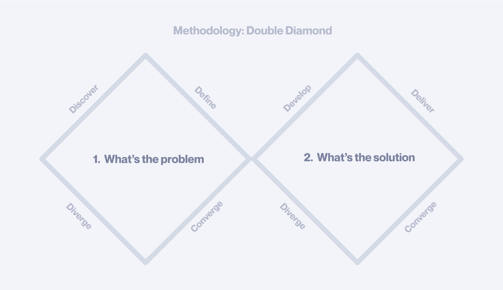
Design Thinking is the act of using the creative process as a problem-solving methodology. What makes this approach unique is that it’s especially good at traversing uncertainty. It provides a methodical sequence — from fuzzy complexity, to clarity.
The particular methodology we employed is called the Double Diamond. It consists of two halves: Understanding the problem and solving the problem. Within each segment, there is a process of expansion & consolidation. These form the diamond shapes and give it its name.
Diamond One: Understanding the problem
Why are we doing this?
- Refocus: The portfolio would serve as the new centrepiece for the product, consolidating the entire company’s value-add into one simple view.
- Future proof: The previous UI had reached its limits. A new modular system was required that could scale with the founder’s ambitious vision.
What would matter here?
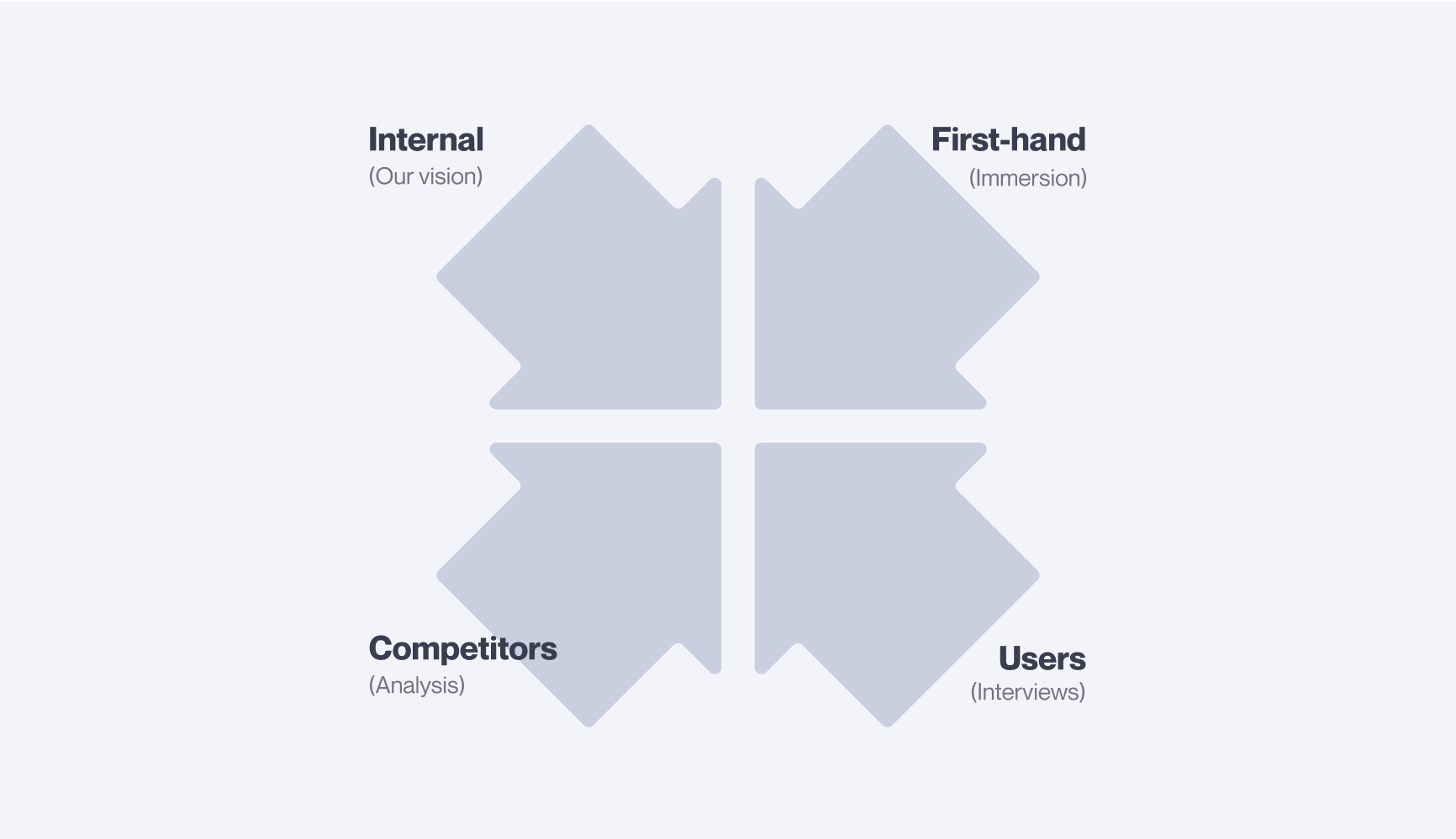
- Our vision: What did we think could help users achieve their financial aspirations? Which solutions might they not even envision themselves yet?
- Target audience: Our new vision would expand to include a slightly different target audience. What would this new audience have in common with their predecessors? Which areas would be different?
Is this something people want?
User Surveys
A series of strategic surveys were sent to 1000’s of users across different cohorts. In addition, Bitwala leadership personally emailed a cluster of ‘super users’, requesting feedback.
Outcomes
- Quantitative data sets
- Identified averages, norms & recurring user patterns
User Interviews
Carefully selected ‘super users’ were invited into the office for in-person deep-dive interviews. Questions were focused on general feedback and understanding the user's financial aspirations.
Outcomes
- Qualitative data sets
- User insights & unexpected discoveries
Has this problem been solved before?
Competitor Analysis
How were other Fintechs solving these high-level problems? How were other companies from any industry solving these fine-grain UX challenges?
Outcomes
- Inspiration for various solutions
- Identified opportunities for brand differentiation
Immersion
The Blockchain and DeFi spaces can be especially complex at times. Immersive first-hand experience with competitor products and fringe technologies gives us a deeper understanding of our user’s needs, both present and future.
Outcomes
- First-hand experience
- Increased empathy
Pulling it all together
All of these complex considerations were pulled together into a crisp, clear definition of the problem. This became the foundation from which our solution would grow, and the criteria by which its effectiveness would be measured.
Diamond Two: Solving the problem
When solving complex problems, where possible, we arrange the challenges into a logical sequence, starting with the most fundamental. From here, we hypothesise and explore solutions, see what breaks, and resolve one after the other. As you’ll see, the process is like solving a Rubik's Cube. Each variable can affect the other.
Static to dynamic
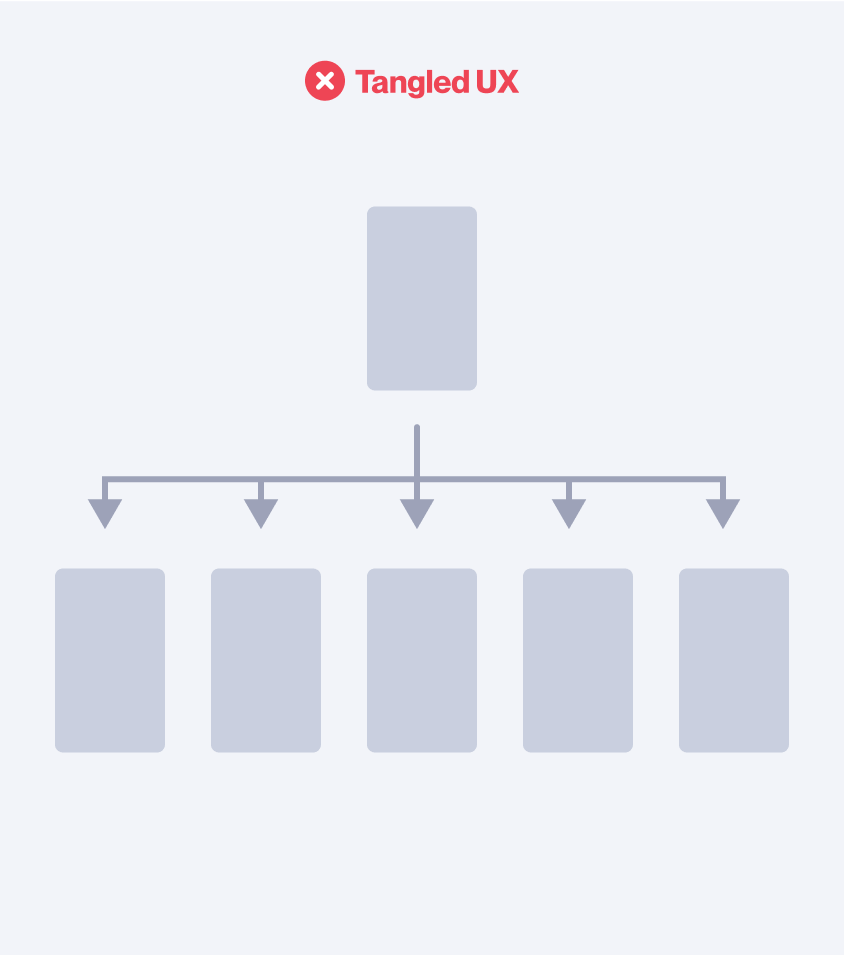

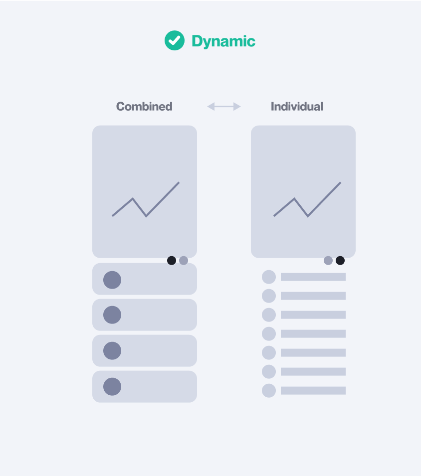
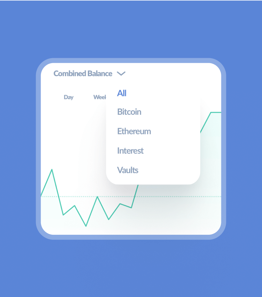
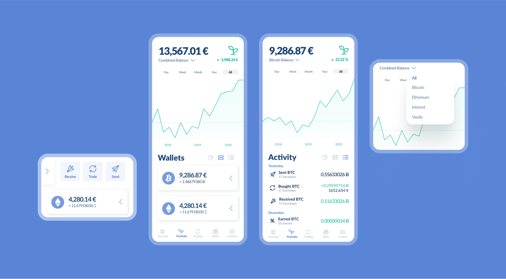
The primary challenge for the Bitwala portfolio was how to make all these elements feel light and easy to interact with. Users would likely have many crypto assets. Having a dedicated view for each would create a tangled, clunky experience. Many competitors made this mistake. The obvious solution was a single dynamic view. But how could this be achieved? This became our working hypothesis.
Design principles
A nested view for each separate asset is not ‘simplest form.’ It creates wasted space and considerably complicates navigation. Instead, a single dynamic view with nuanced filters allows all the benefits of nested views, but without the clunky UX.
Striving towards ‘simplest form’ is one of our core design principles
The best design, like the best math or engineering, strives towards elegance. This means the removal of duplication and unnecessary noise. By stripping away clutter, we create clarity for our users.
The next three segments explore the knots that were created, aiming for a single dynamic view.
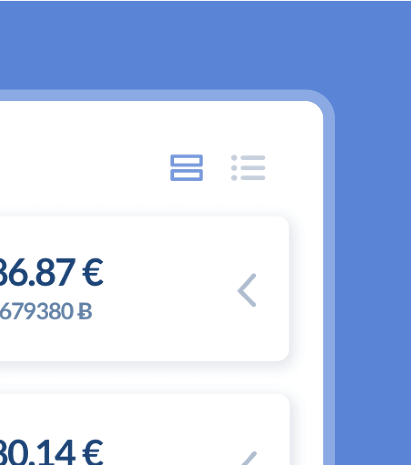
Knot 1: Wallet actions
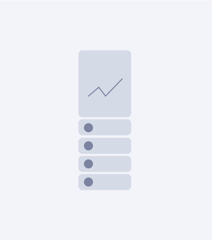
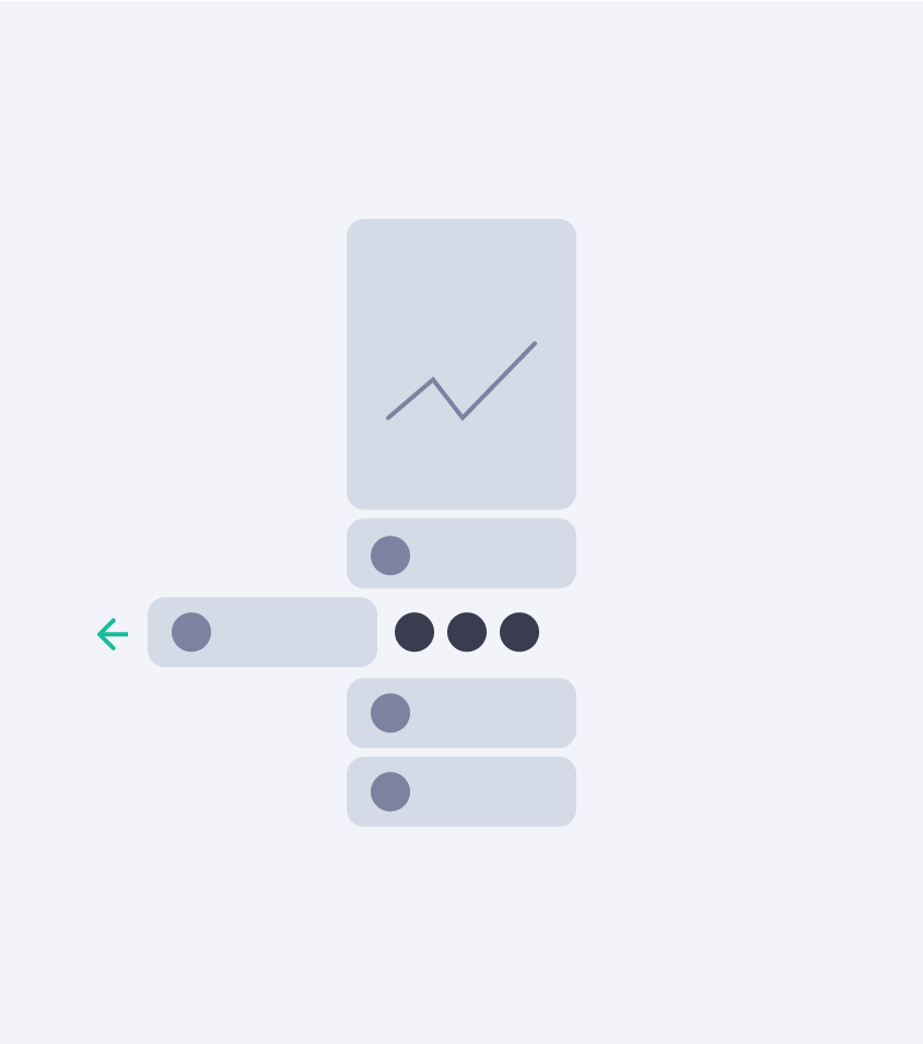
By placing all the crypto wallets on one screen and having each asset share the graph, the user quickly had an overview of their wallets. But what about the actions? These had plenty of space in the nested views.
I was looking everywhere for inspiration when I eventually found it beneath my nose. Many messaging apps (like WhatsApp) hid actions under a swipe. After some exploration and fine-tuning, I could see it would work for us too.
The best solutions often come from finding solutions to the same UX/UI problem in different industries
It worked so well that when an ex-N26 (German unicorn) employee joined Bitwala as the new CEO, she told me that they had actually drawn inspiration from this and implemented it in their banking app.
Knot 2: Transaction history
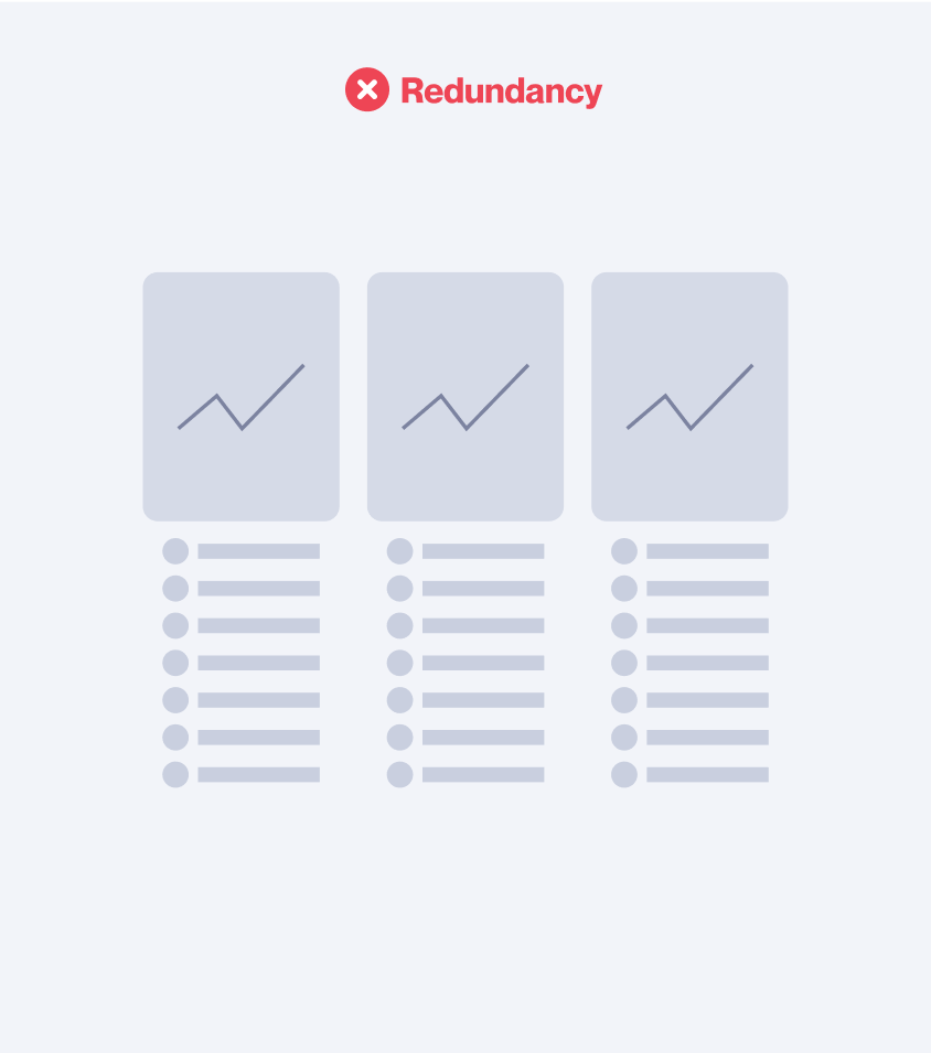
Another reason competitors took the easy path and simply nested multiple wallet views is the second knot, transaction history. Every asset had its own history. Again, how can we create more real estate with nothing?
After much Rubik's Cubing, I realised that the UI could potentially switch between wallet view and transaction history, as they are not needed at the same time. This elegantly solved our real estate problem, but as usual, created a new challenge.
Knot 3: Smart controls
I’d found a way for the interface to move and adapt to accommodate all the required information. But how to control all this? With so many moving pieces, how could we make these controls simple and intuitive?
An elegant solution always looks simple in retrospect. But the journey there was anything but. Rather than each module having separate controls, we introduced a global filter at the top, which affected everything beneath it. Within that filter range, a user could then choose to view their wallets or transaction history.
With 2 clicks, any view was possible. A swipe and click, any action was possible
We had achieved an elegant interface, but was it intuitive? To validate our concept, we created click dummies and ran user testing sessions. First internally, then with super users. Success! All the users understood the patterns and operated the new design easily.
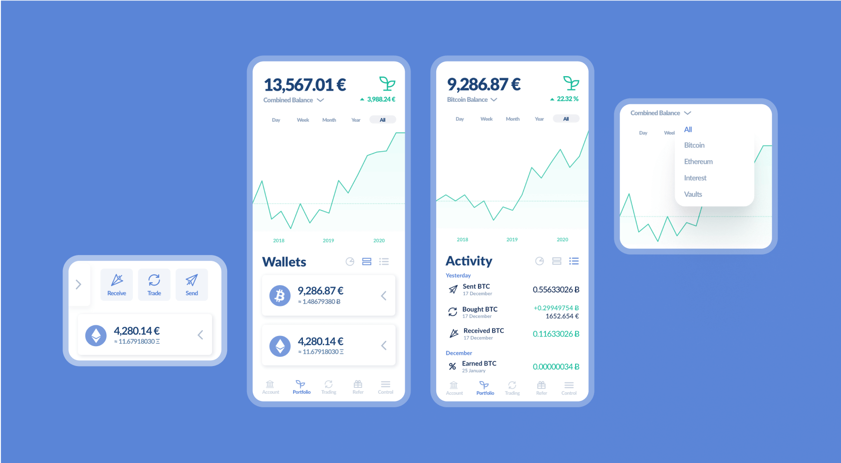
The outcome
All the value-add of the entire product was condensed into a single view. The bitwala portfolio became the centrepiece of the new product redesign. With it, Bitwala scaled from Series A to Series B, and a valuation of 144€ Million.
The compositional trick of tying everything together into a simple, elegant view is what we call a product keystone. When done correctly, it elevates the user experience immeasurably. The whole is elevated beyond the sum of its parts. It provides a clear emotional and functional focal point to delight both new and existing users.
Composition is clarity
This case study focuses on Bitwala’s fintech portfolio, but the principles of creating a product keystone are universal. How might this look in your app?
Have a project in mind?
Share your idea with us!