Using design discovery to facilitate strategy
Dreamvest — Case Study
Summary
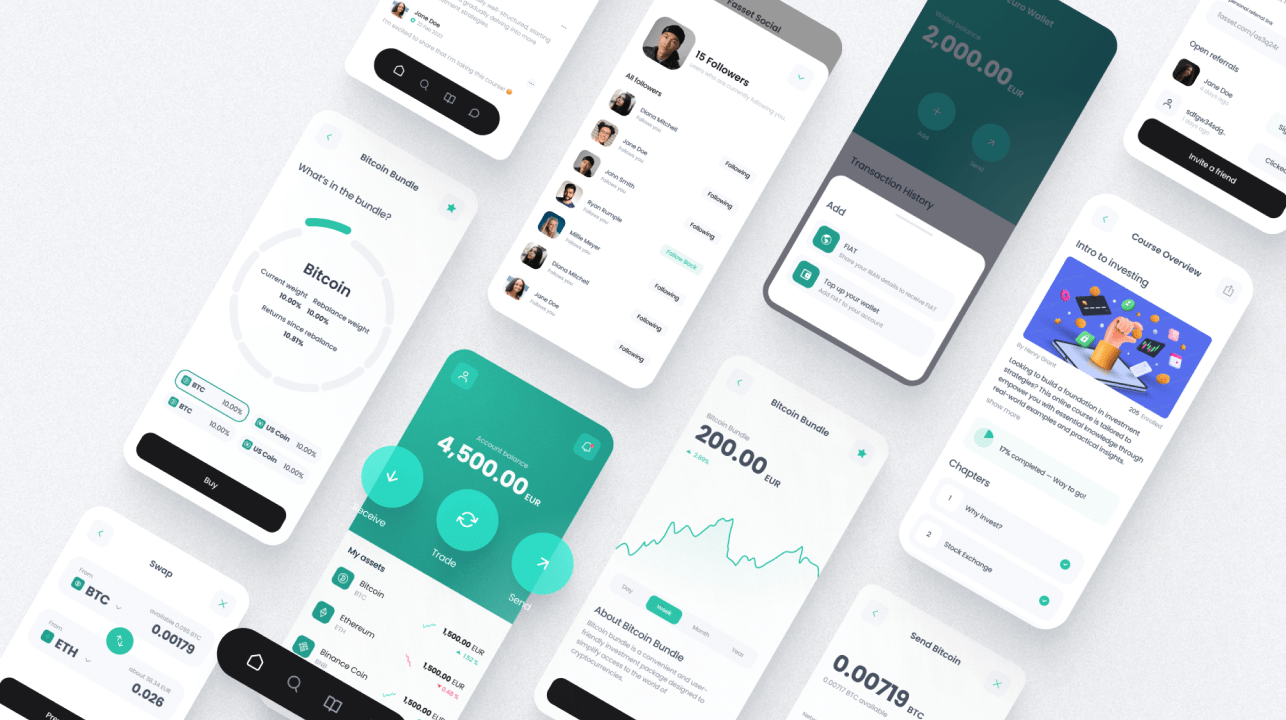
Dreamvest helps users achieve their dreams through smart money management. When we met, the founder was just coming out of an incubator and looking for help distilling his business concept into a tangible product design.
With some fast-paced design development, we explored possibilities, stripped away the fluff, and defined the product’s x-factor. The output was the engineering handoff for a minimum lovable product.
Project Spotlight
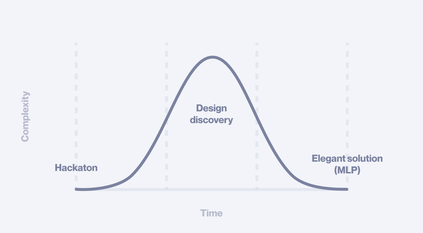
Lean precision at its best. Maximising opportunity within constraints
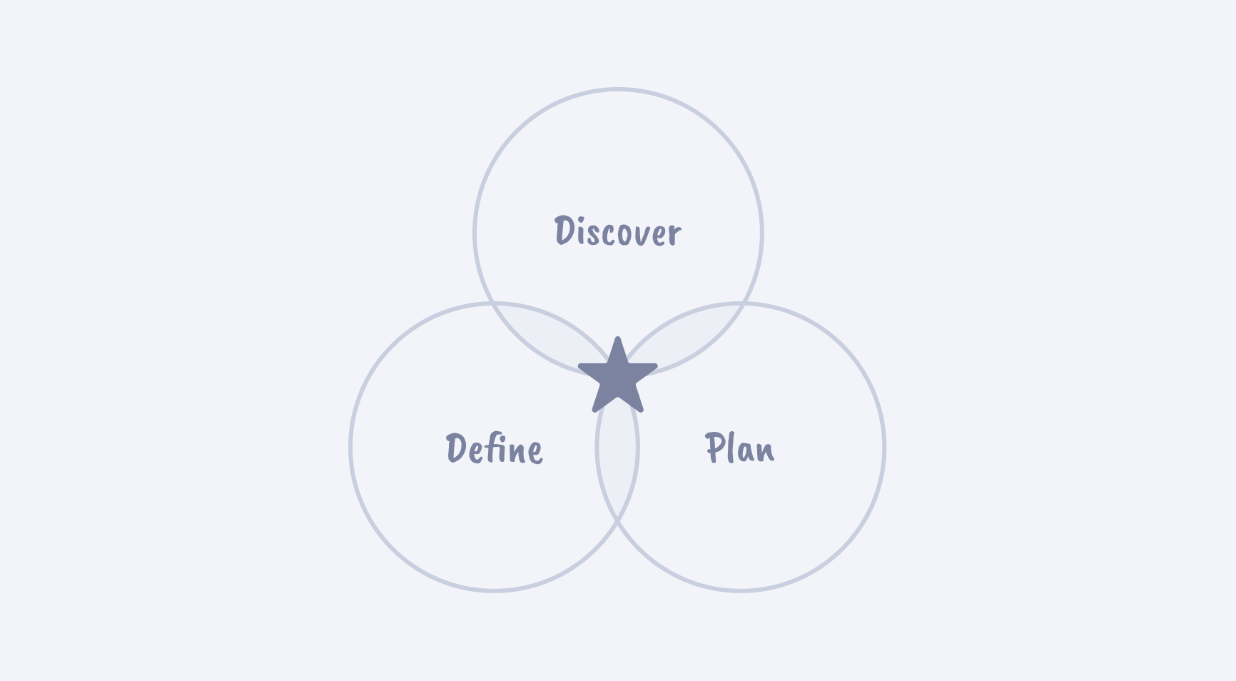
Orientation
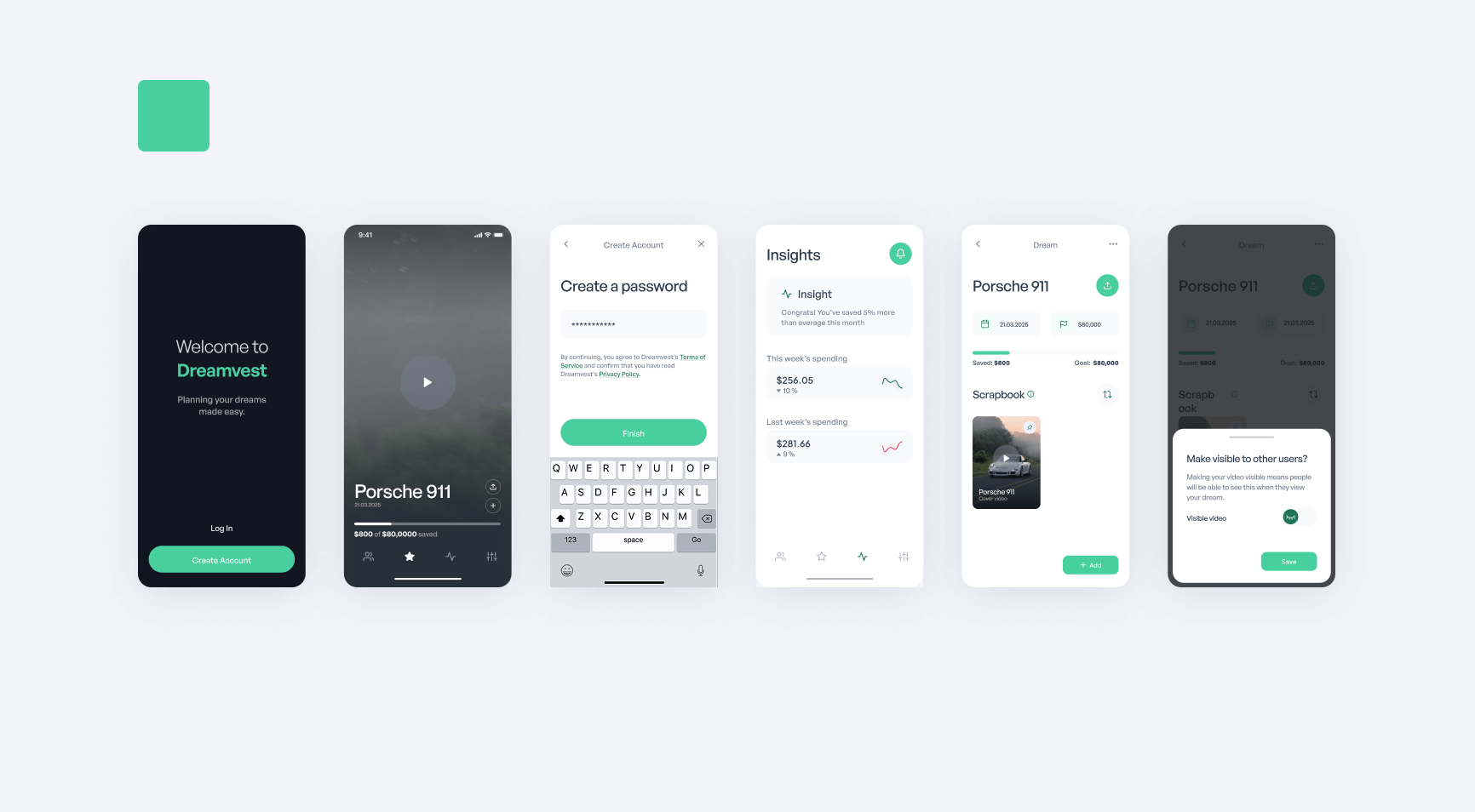
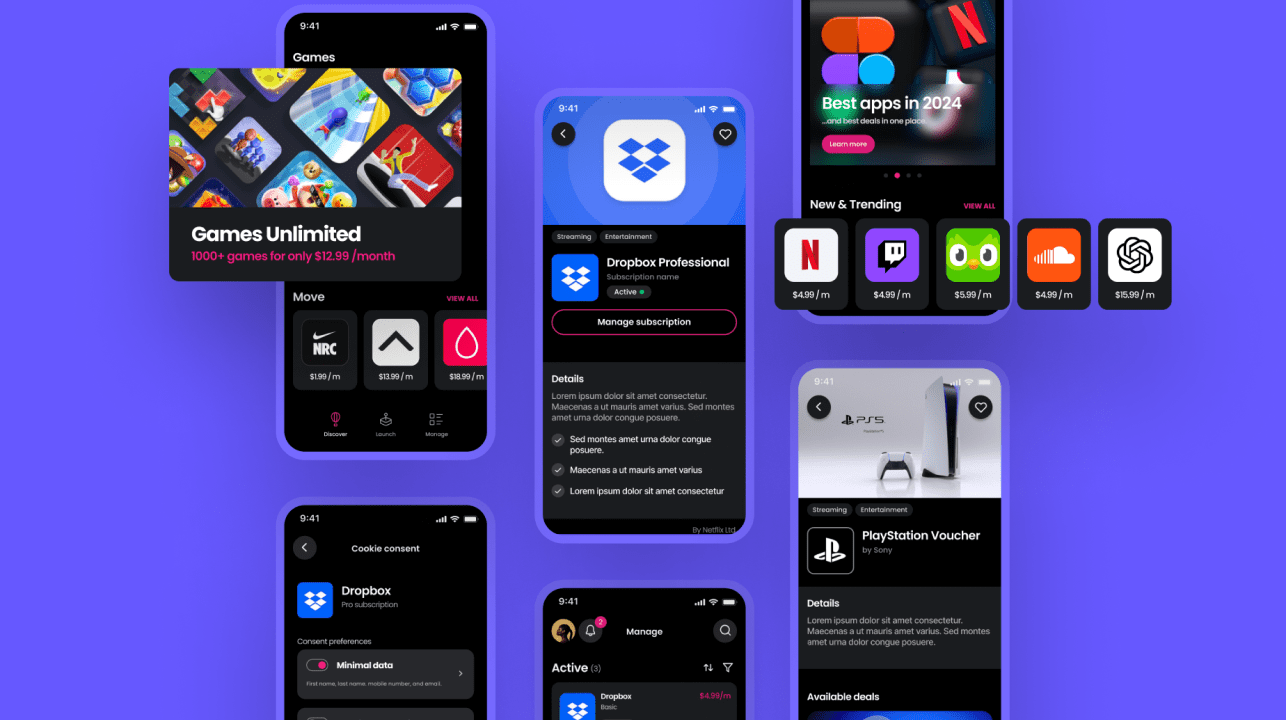
We started with a hackathon. We blocked two full days and in this time sprinted from fuzzy idea to a complete concept. This included app architecture, a dozen user journeys, and a hifi sample for a potential look and feel.
This first iteration was of course just a raw concept. Yet this was more than enough for the founder to present to investors, gather feedback and get sign-off. With this, it was time to design the v1 product.
Zero to one
Although we learned a lot from the hackathon, we began the full design sprint with a clean slate. The top-level objective was to quickly create a minimum lovable product that would be built and tested with early adopters.
The founder did not ask for us to simply visualise an idea. Instead, he leveraged our creativity and expertise for design discovery. Throughout the entire process, we explored potential opportunities, identified high ROI areas, and fed our learnings back into design development.
Discovery sweep
The founder kicked us off with a broad range of possibilities to explore. By working in low resolution we were able to cover vast amounts of terrain quickly and at low cost.
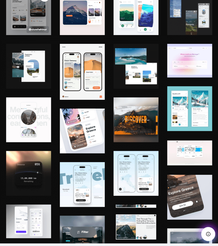
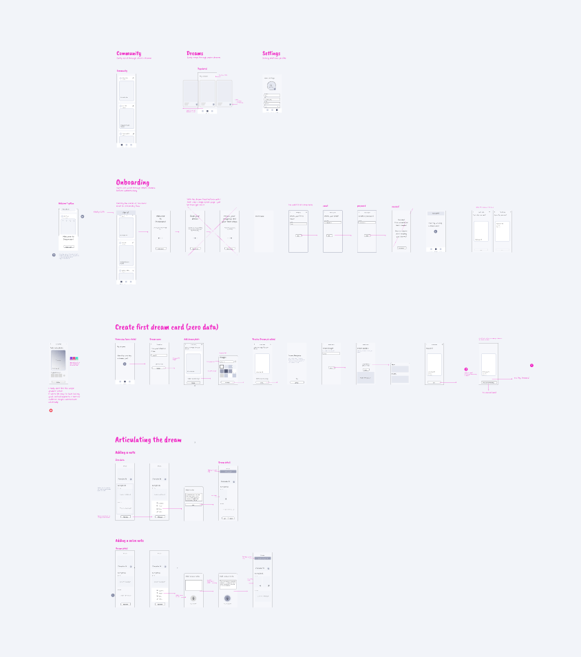
We combined research, our own experimental development, and industry best practices to quickly map out the problem/opportunity space.
Finding the centre
As we connected the pieces along the way, a cohesive whole started to emerge.
With a clear (low-resolution) overview of the potential product, a common and expected issue appeared. There was too much functionality pulling in different directions.
Less is more
After exploring an array of exciting potential, it can be tempting to try and stuff everything into the first version of a product. This is problematic for a couple of reasons. Too much functionality will of course take longer/cost more for the engineers to build. But beneath the obvious, lays a much more serious issue. If a product tries to do too much at once, in the eyes of a user, the USP will likely be lost and the total value diluted. This is a very common mistake.
The MLP methodology goes far beyond enabling a quick build, it forces difficult strategic questions early on, when they matter most.
Reduced scope forces questions of priority, which in turn refines and consolidates the concept. This ripples through the UX and UI of the product but often goes further into the GTM strategy and marketing narrative. Intense focus forces everything into alignment.
What matters most
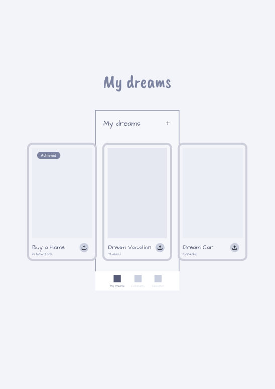
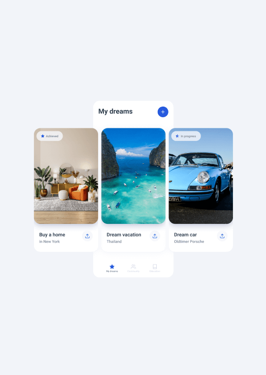
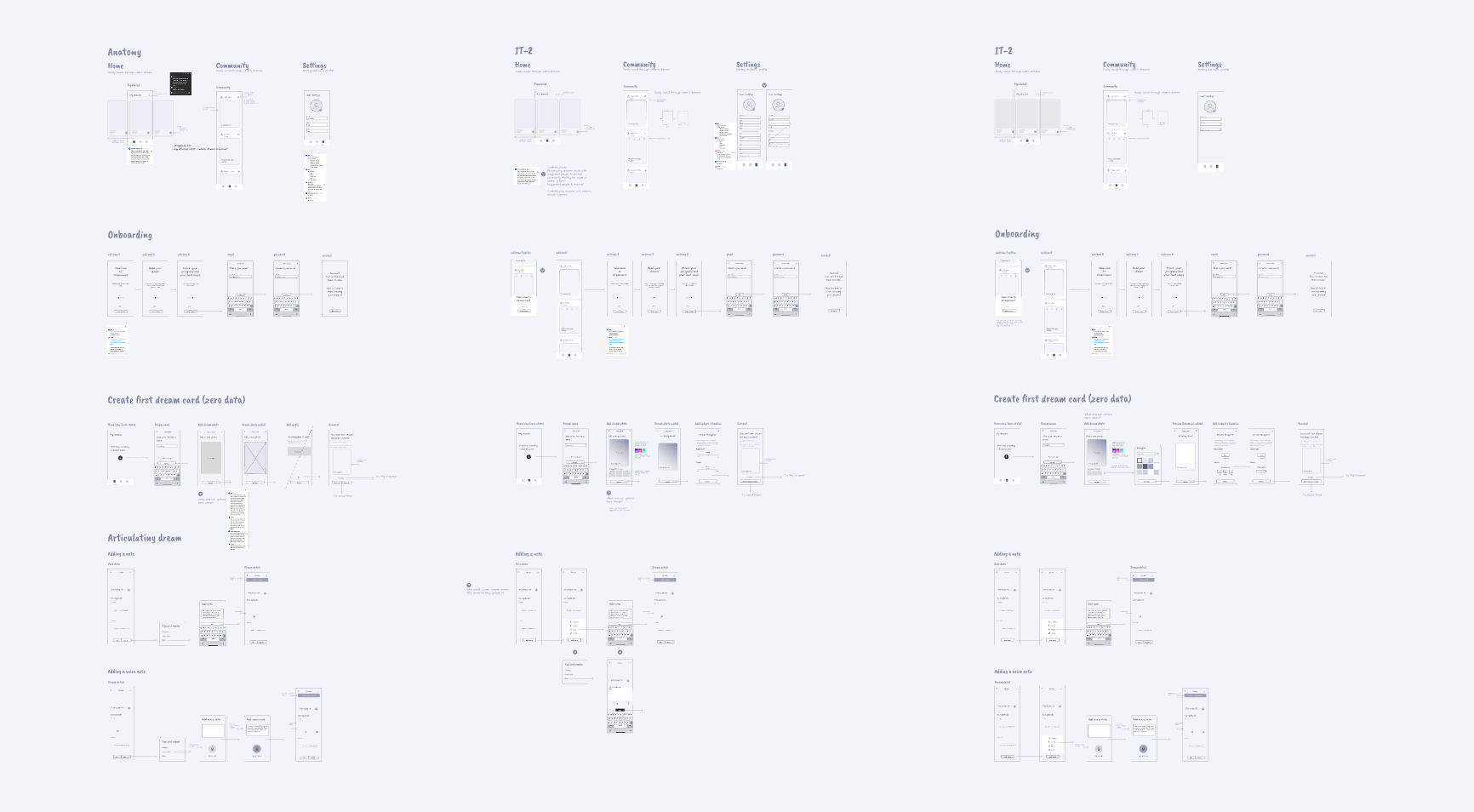
By mapping out all the various directions in low resolution, it made it much easier to evaluate their potential and decide what we wanted to keep for v1, and what could be either discarded or postponed for a later release.
It quickly became clear that only one of the above three feature streams could (or should) be implemented in v1:
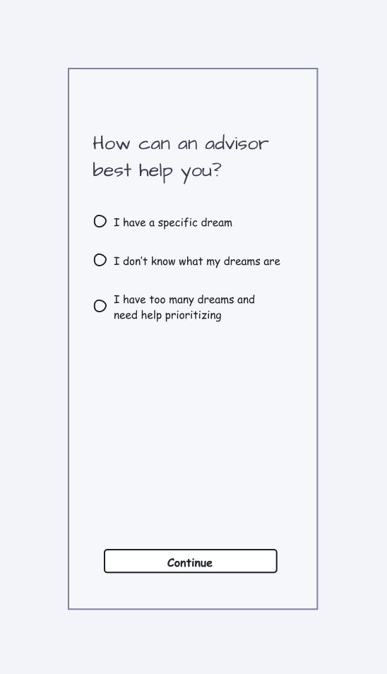
- Discovery: helping users figure out their dreams
- Social: viewing others’ and sharing user's dreams
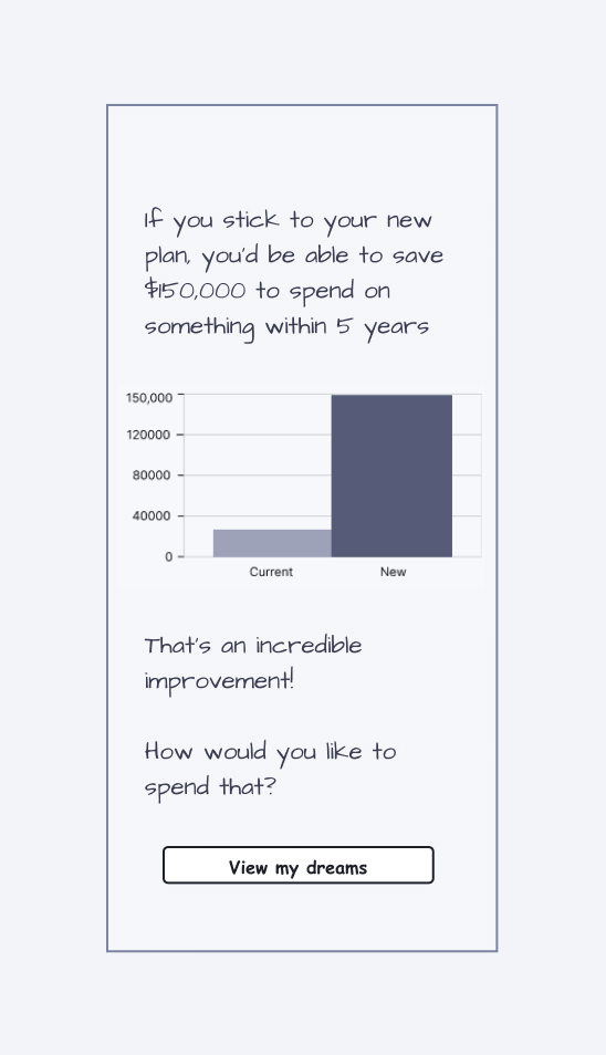
- Financial: economic planning to make dreams a reality
A singular concept
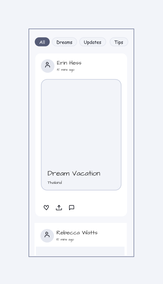
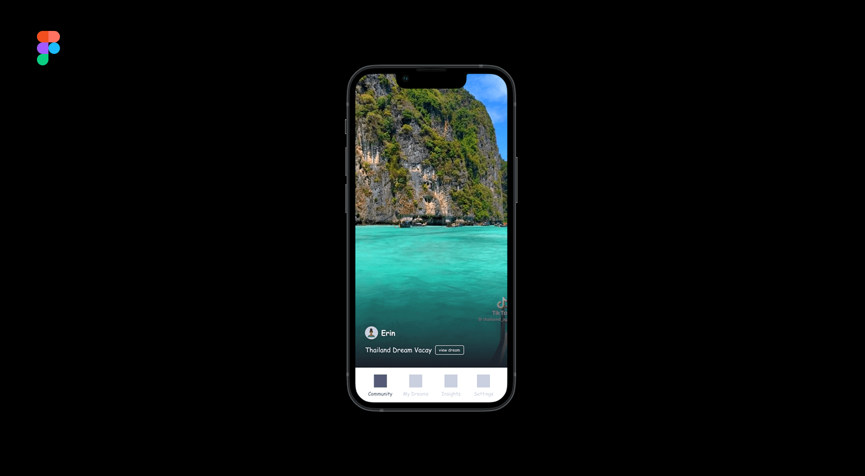
The social media concept (B) was differentiated (within our market), engaging, inherently sharable, and within scope to build. It was decided the v1 release should optimise for this.
We set about re-arranging the product architecture and embedding the social component at the centre. Moving forward this would define the essence of the product experience.
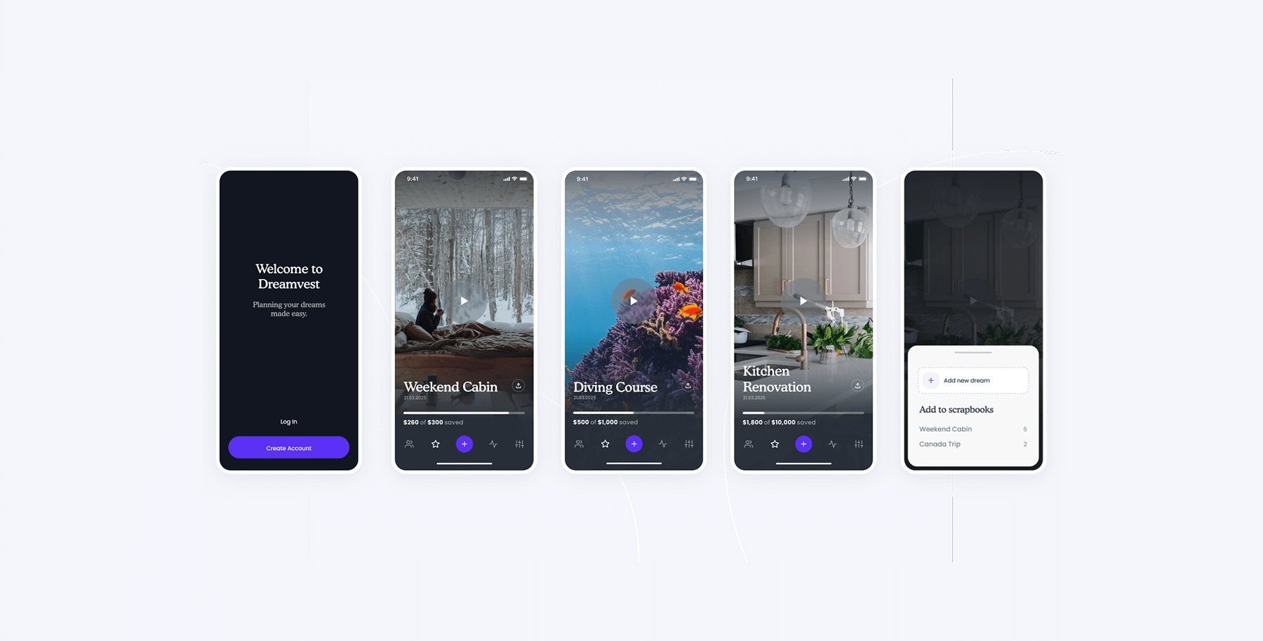
The keystone
With every project, we aim to create a magic moment. This is the ‘aha moment’ when a user understands the amazing value that’s offered. We’ve named the part of a digital product that creates this effect, the keystone.
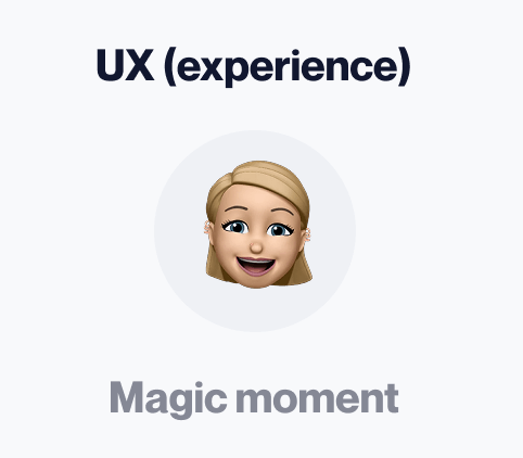
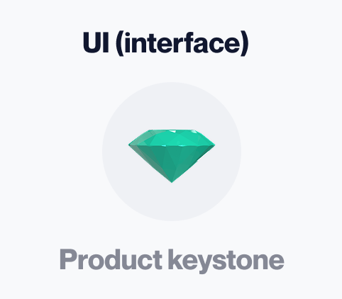
The keystone is a unifying element that holds the larger product composition together. It is the heart of the user experience. Without one, a product feels like a patchwork of functionality instead of a unified whole.
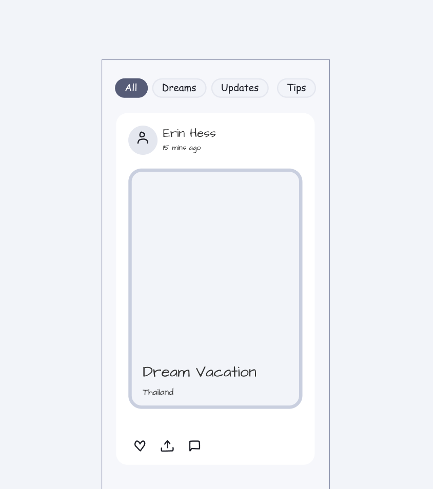
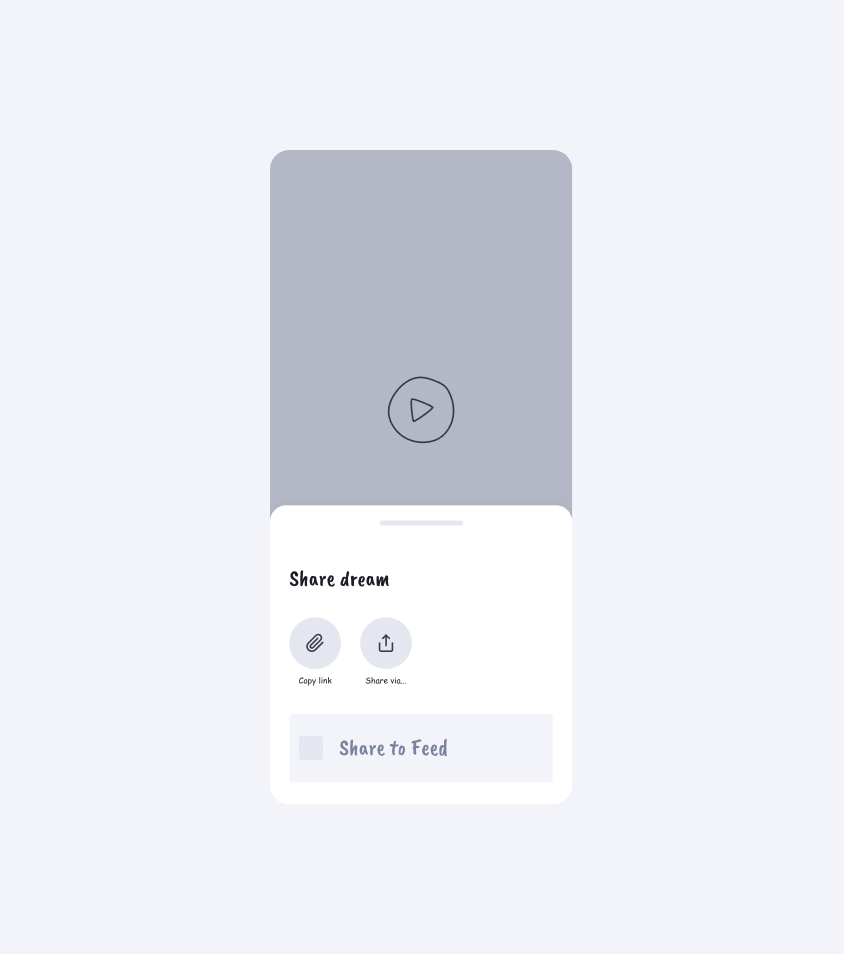
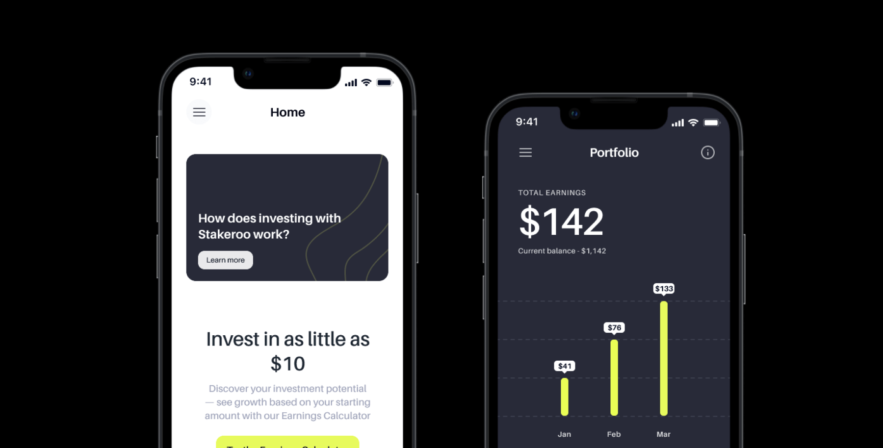
For Dreamvest, the keystone was the dream object (technical label.) This single data object seamlessly changed depending on context.
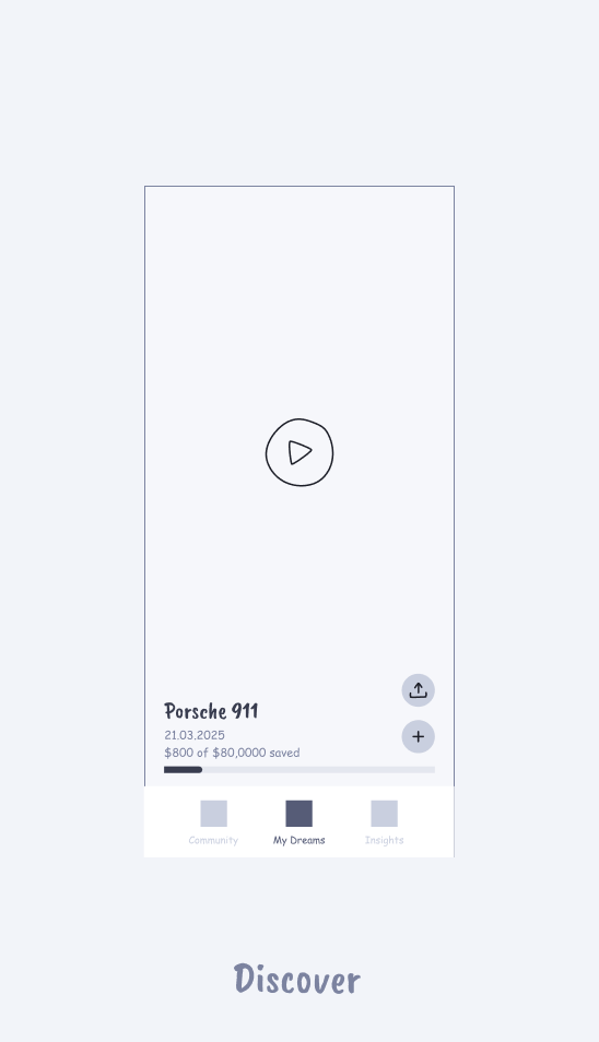
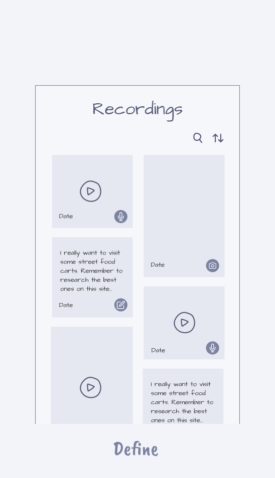
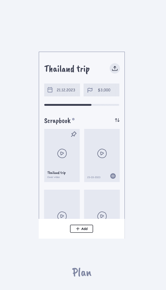
‘Dreams’ could be discovered and shared via the feed, defined and recorded privately, and organised for financial & practical planning.
Immersion
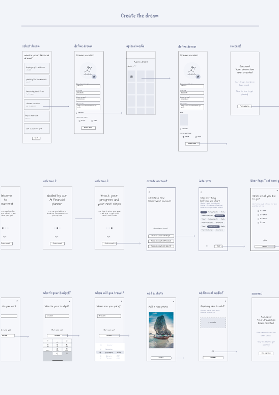
Next, we hotwired the core functionality together as a low-resolution click dummy. Bringing the experience to life with video and interactions quickly gave us a feel for the end experience we were designing toward.
Testing with dummies is essential. Even just internal testing. This early immersion quickly shines a light on any potential cracks in the UX and allows easy fixes while still in design development.
Get your Zero-to-one Playbook
7 battle-tested principles for launching products that succeed.
Brand styling
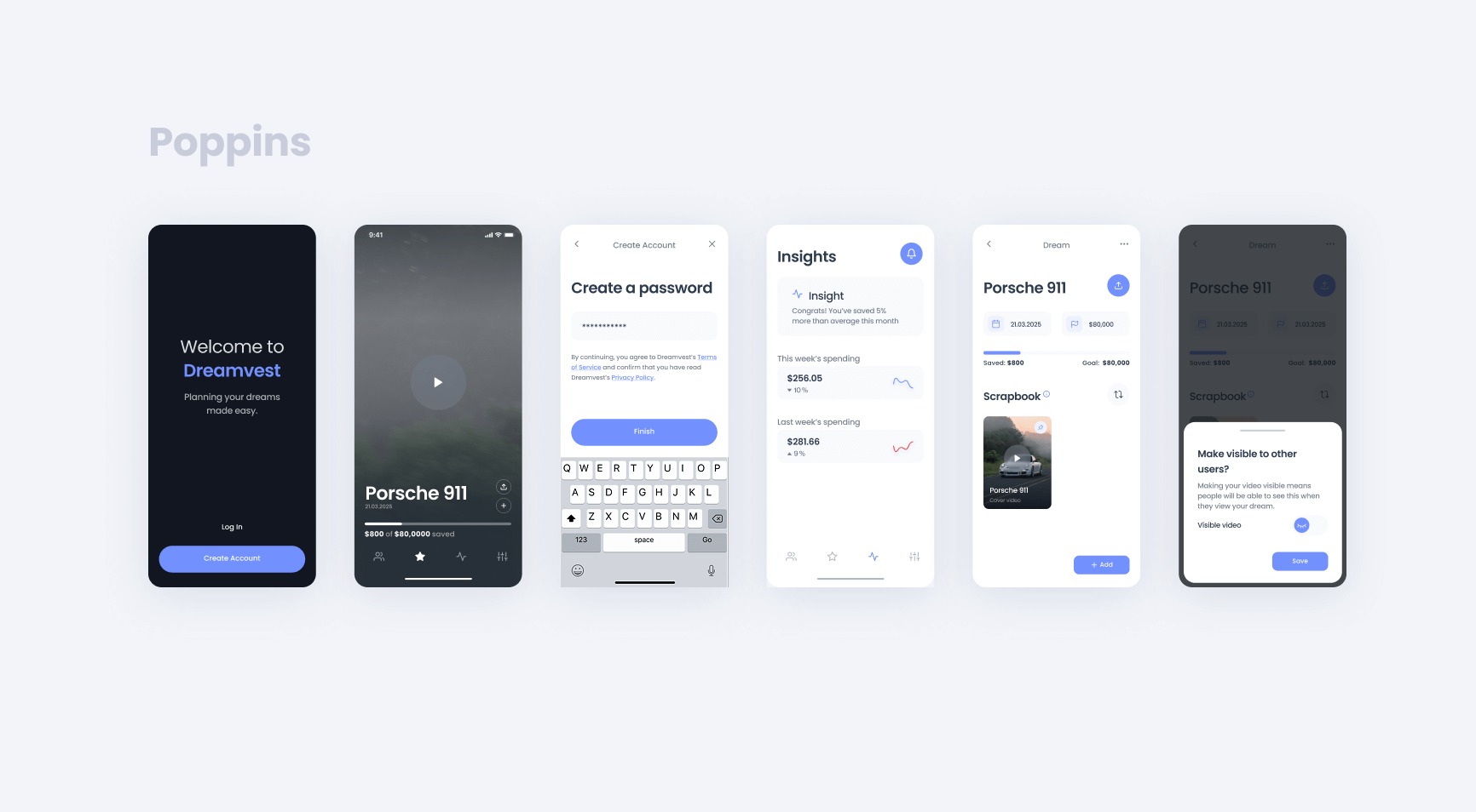
In a parallel workstream, we began brand exploration. The founder was very happy with our portfolio and gave us a lot of creative freedom in crafting a new look and feel. After putting forward a general aesthetic that was approved, we followed with a few variations of font and colour to refine the details together.
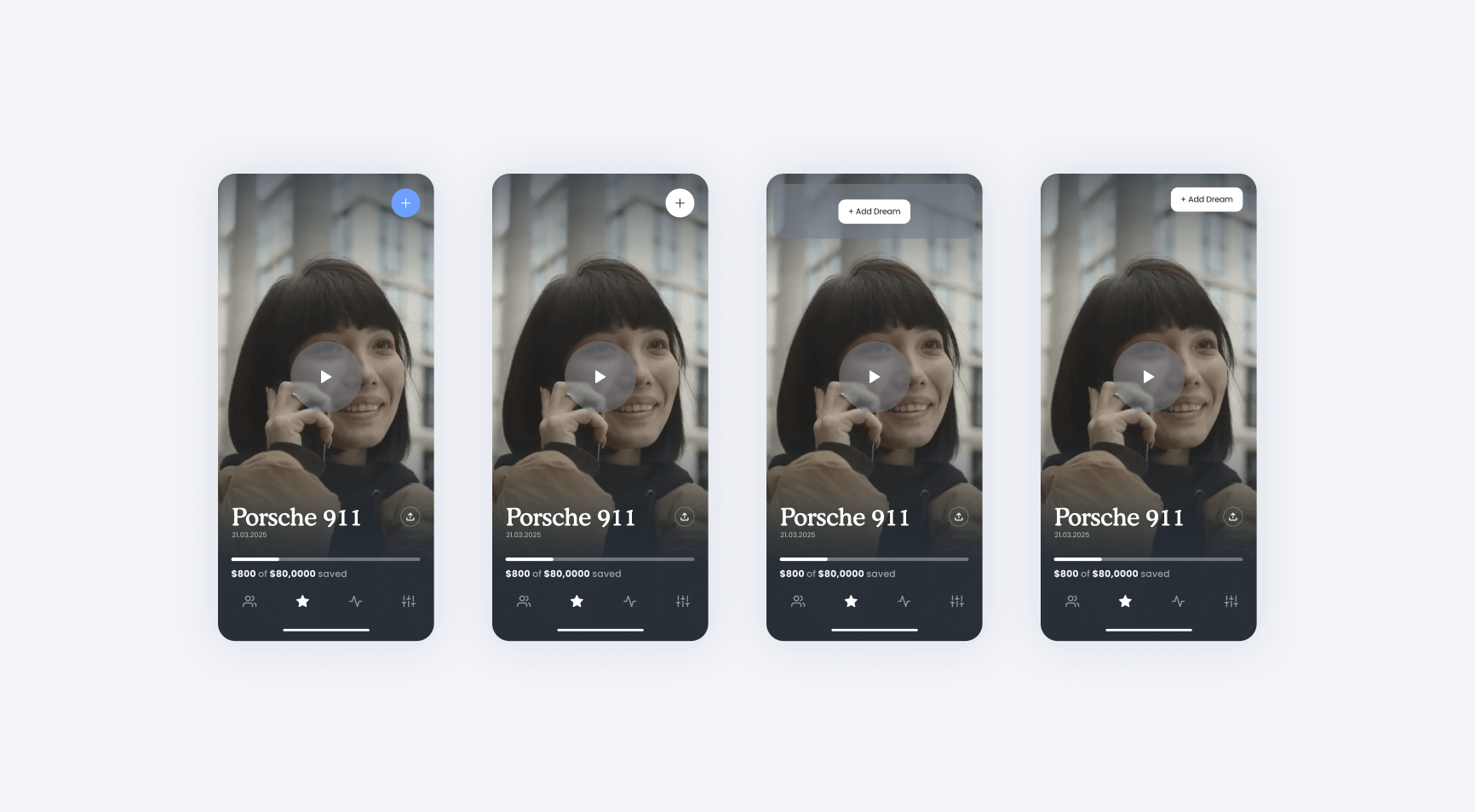
Colour alternatives
Font alternatives
Component exploration
Even on a lean budget, and tight deadlines, strong foundations can quickly be brought to life with a splash of colour and a well-selected font. Strong bones are easy to emphasise.
Design system
With every view of our product now defined at high fidelity, it was time to deconstruct it all for the engineers. We work closely with the tech team in all our projects.
Each engineering team always has their own unique requirements. Good design means working within these constraints.
Although the specifics for each client are unique, our design system deliverable always includes these three fundamentals:
- DSG: the design system guide
- Atomic components
- Figma components
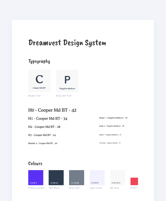
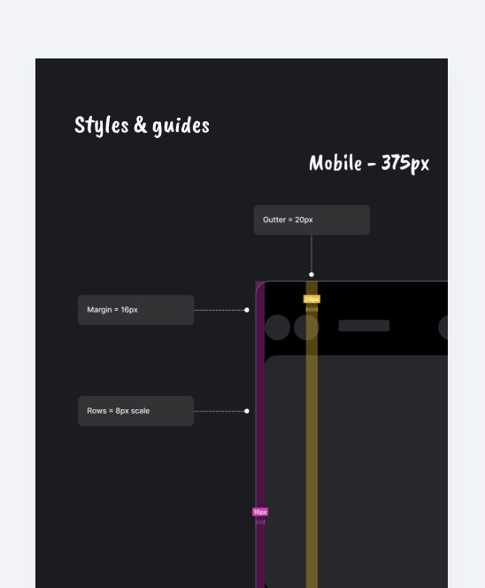
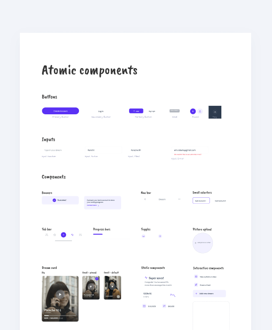
Together, these form the design system. The atomic components are like lego bricks, which the engineers can then construct the UI from. The guide is a set of styles and rules for correct application. Figma components are an optional extra, they enable internal teams to quickly make their own designs. With these, stakeholders can quickly create new views and flows themselves.
Final deliverables
The final handoff included the design development files that recorded all our decisions throughout the design process. We also created a master file which detailed the final design in terms of both product architecture and user flows. Finally, we included a design system document which detailed all the rules and building blocks to create everything for their development team.
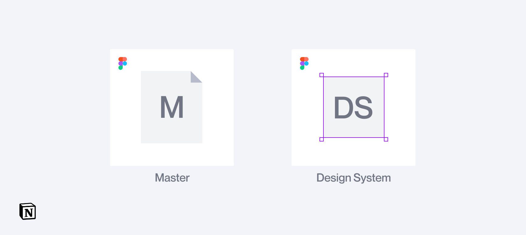
All bound together on a Notion page
Have a project in mind?
Share your idea with us!