Pre-validation: launching a product that users already love
Mondia — Case Study
Summary
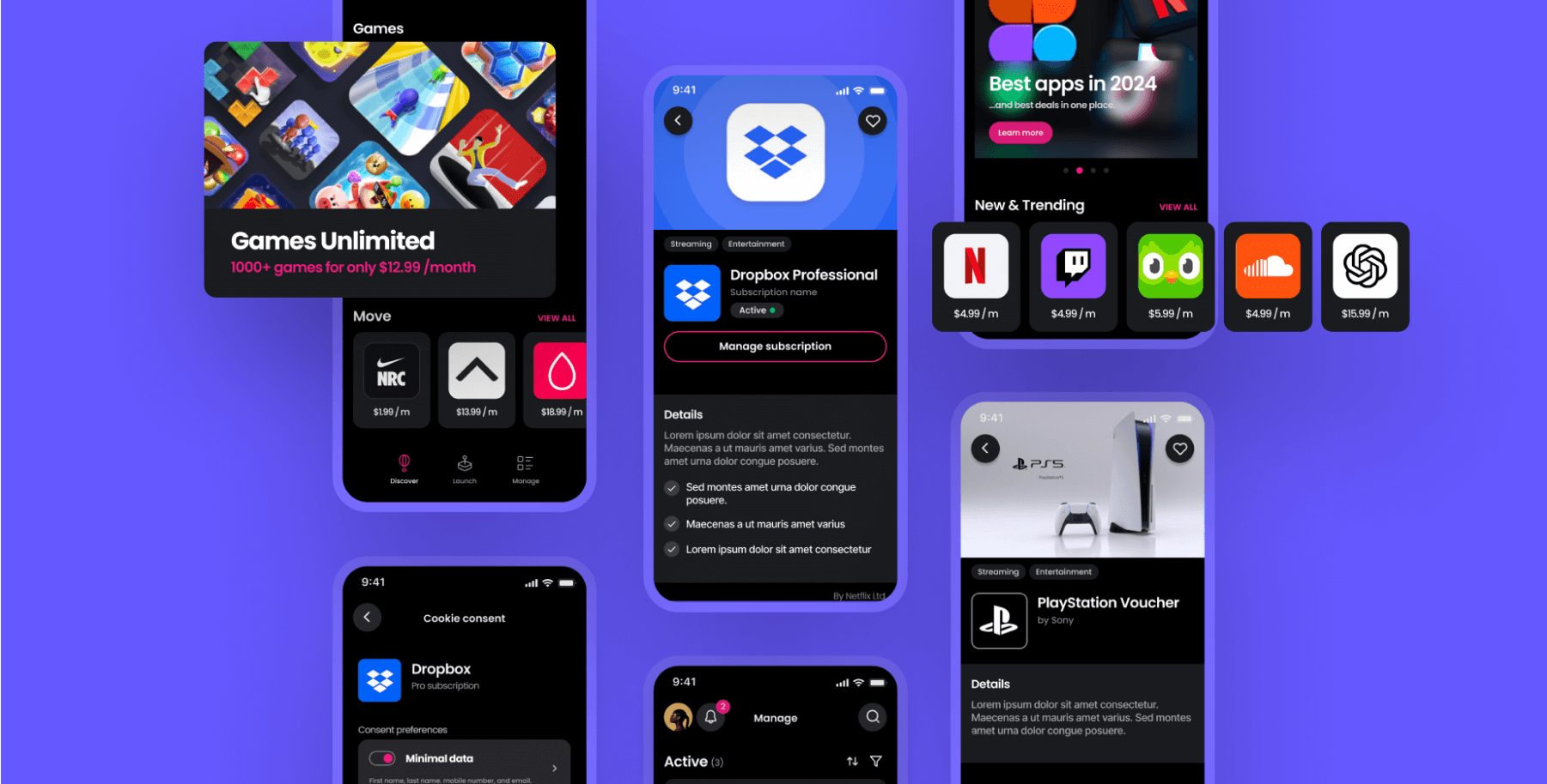
Mondia is a global telecommunications platform serving millions of users all over the world. They were looking to create a new stand-alone subscription management app, and turned to us, to inject startup innovation at enterprise scale.
Throughout the project, we handled all the design work, ran in-person user testing sessions, summarised findings for stakeholders, and generally led the creative development of the product toward a validated solution.
Project Spotlight
Incorporating user testing into design development to de-risk launch
Iterative sequences
The project was split into work packages. Each followed a design, test, learn, sequence. Testing would be done with click dummies, pre-build. The objective was a certain level of clarity before we handed off to engineering. We did not know how many sequences would be required before we began.
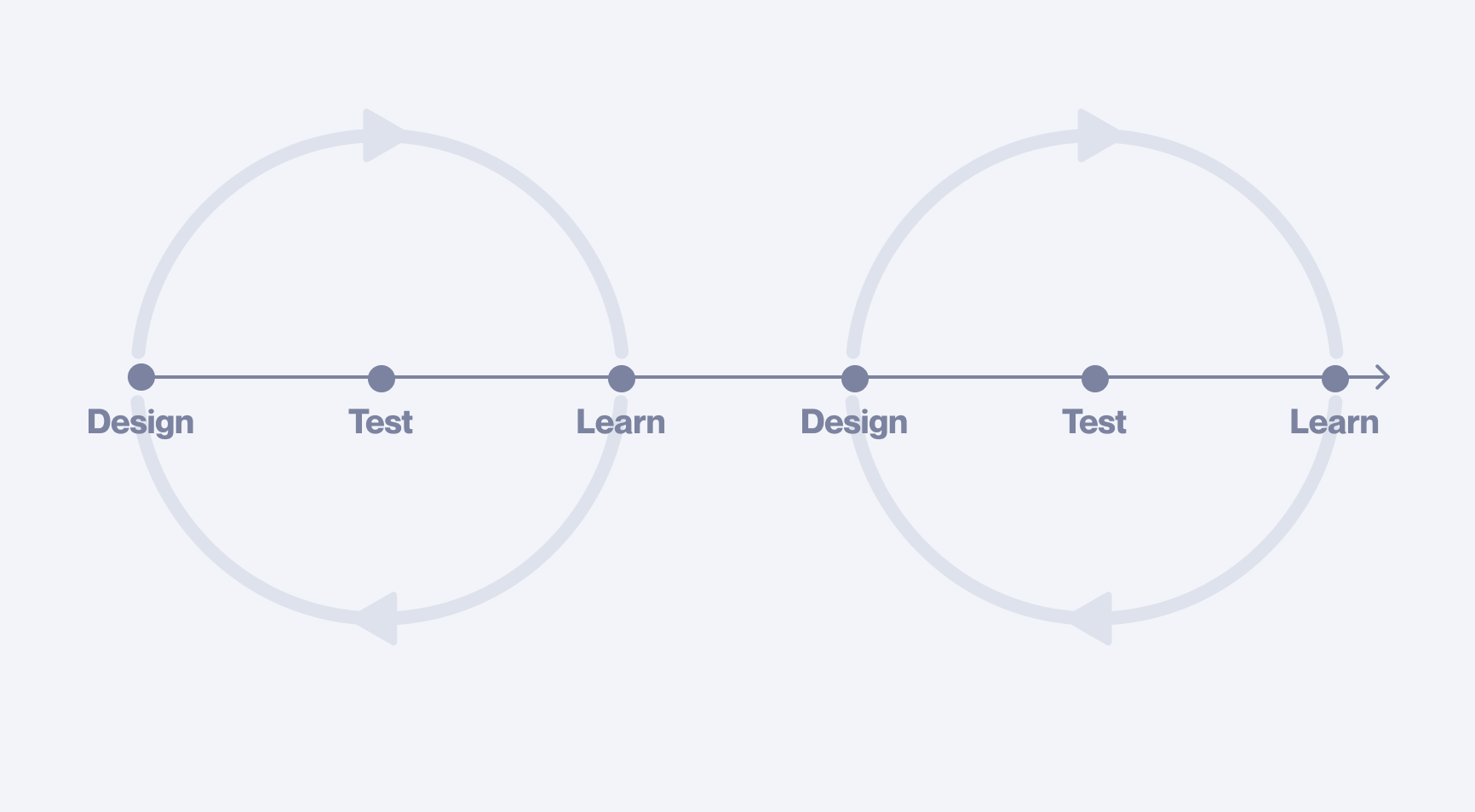
Testing with click dummies pre-build is still criminally underused within the industry. So many of the important insights and discoveries that are achieved during user testing a live product, can also be achieved with click dummies — at a fraction of the time and cost.
Design sprint — 1.0
We received a brief from the client that clearly defined the top-level objective. It was also, intentionally sparse on details. The idea was to use our external perspective to drive innovation amongst an extended group of over 80 enterprise stakeholders. This intentional ambiguity from the client members in our working group, cleverly allowed us to maximise creative potential in a large organisation.
Design-led
We led the creative process, mapping out possibilities in low resolution.
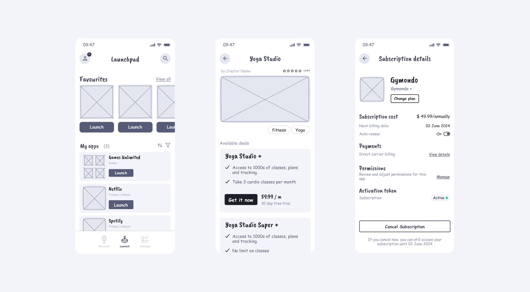
Having something tangible to review and critique was essential for the client. Our design artefacts quickly became the centre-point for internal discussions. Should games be included with all app subscriptions? Which payment flows should be enabled? Questions like these had not just UX implications, but far-reaching strategic consequences.
Our work enabled less product-experienced members to visualise competing concepts and understand the implications behind each decision.
In this way, across consecutive iterations with stakeholder feedback, the scope and functionality of the product evolved toward a stable solution.
Disputes
While our process enabled significant stakeholder alignment, some strategic disputes remained unresolved, for example:
Standalone vs Embedded
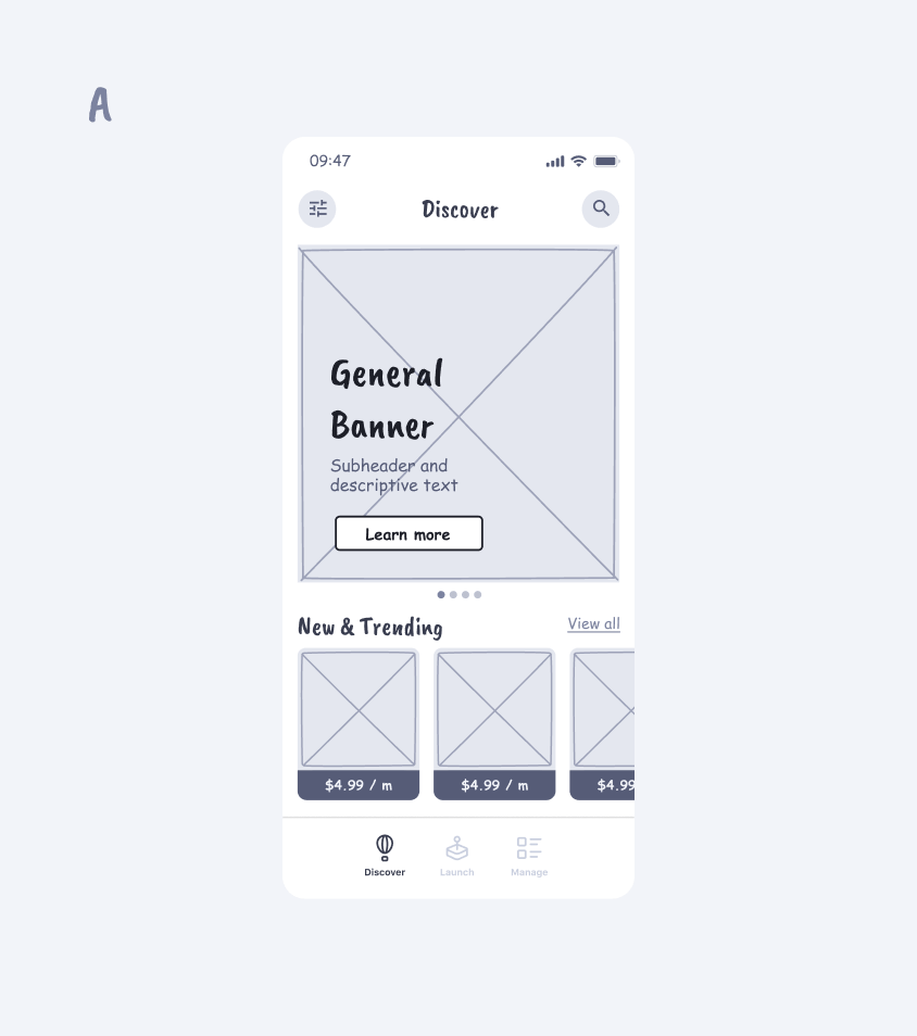
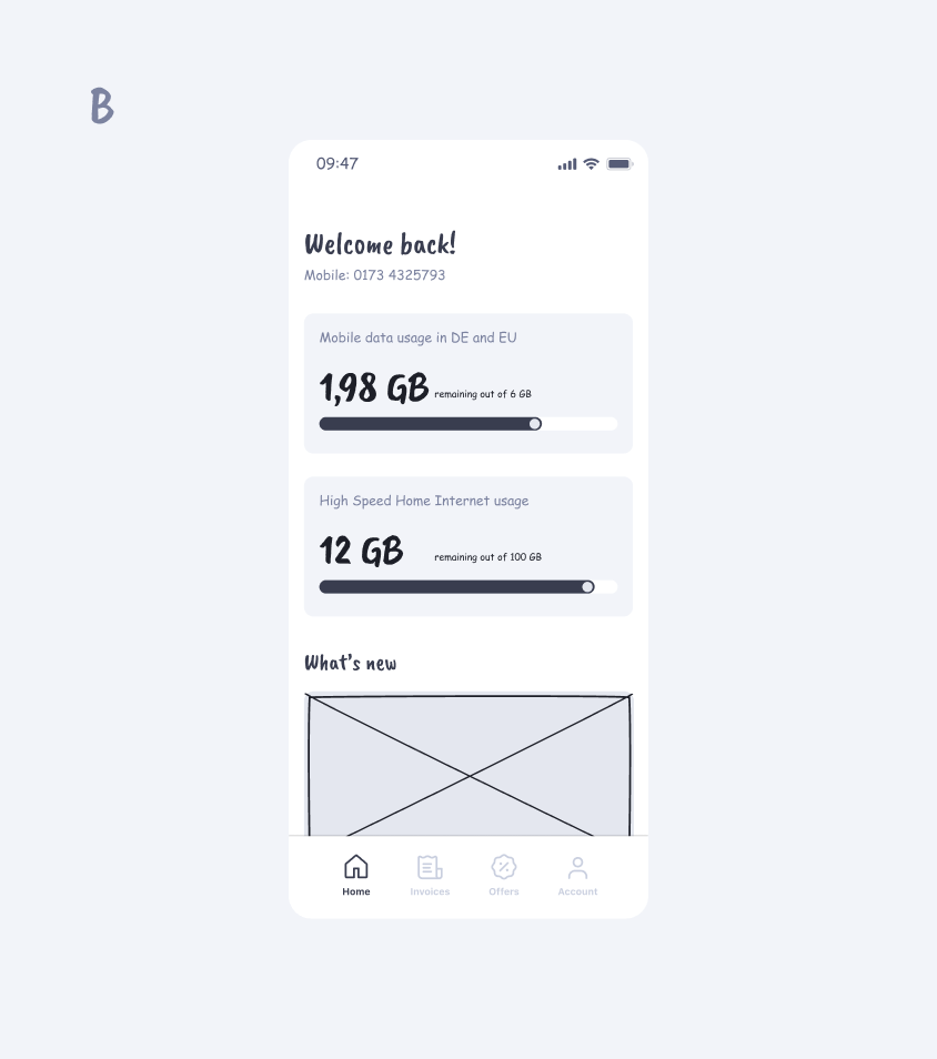
The sales team preferred our product to be embedded within existing solutions because of the exposure — millions of users would see the new entry point. However, product stakeholders wanted a standalone version, hypothesising that users would much prefer this option, driving long-term retention. This is exactly the type of question user testing can answer.
Get your free UX Audit
We offer a limited number each month. See if you qualify!
User testing — 1.0
The primary objective for testing was to validate the general concept. Beyond this, there were a series of smaller goals. Most fell into one of three categories: answering questions like standalone vs embedded, identifying any major problems, and uncovering new opportunities.
Click Dummies
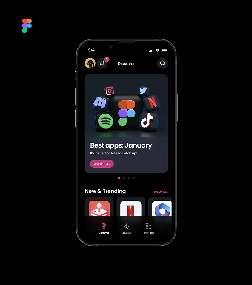
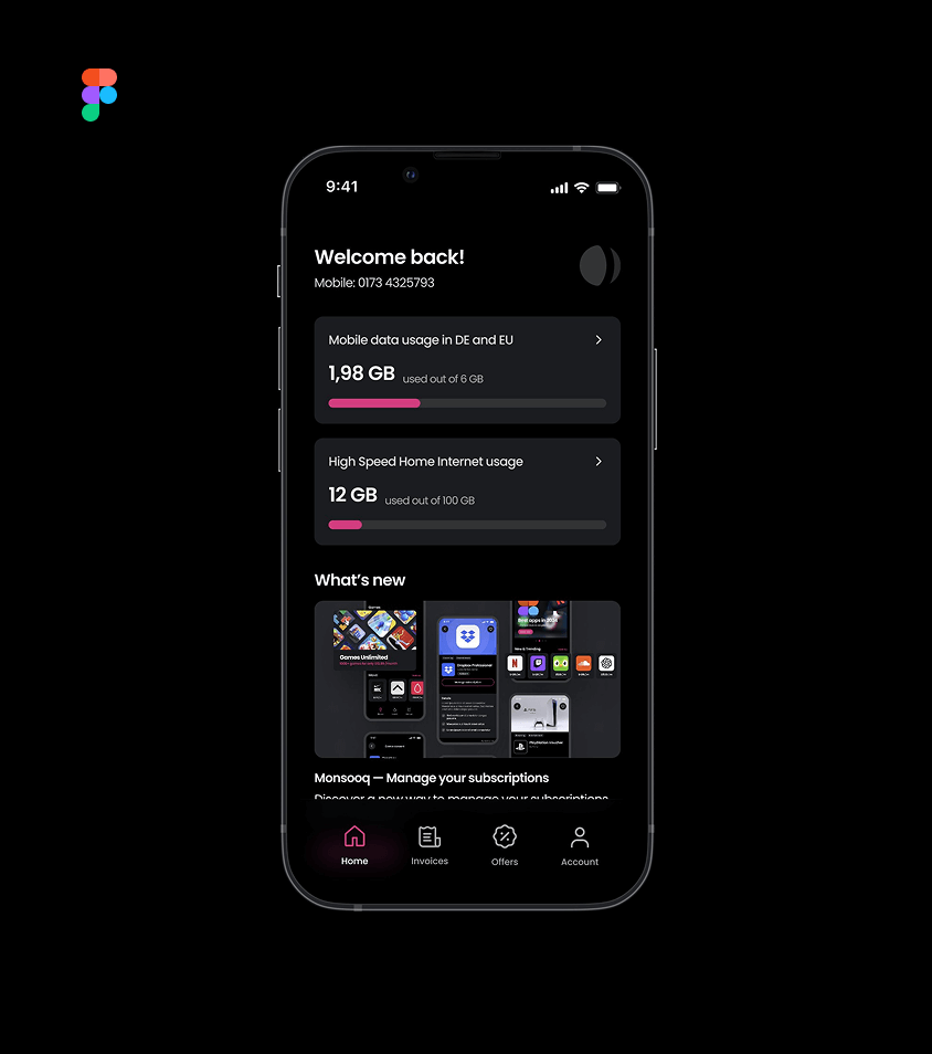
Testing was done with Figma click dummies. The level of functionality that can be accurately mimicked with this tech is constantly improving. They’re fast to create and a fraction of the cost of an engineer to get something on staging.
The sunk costs avoided by not building and discarding features that users don’t want, cannot be underestimated.
By testing with click dummies throughout design development, we were able to make dozens of fundamental decisions during the creative process that shaped the scope and structure of the final product.
In-person testing sessions
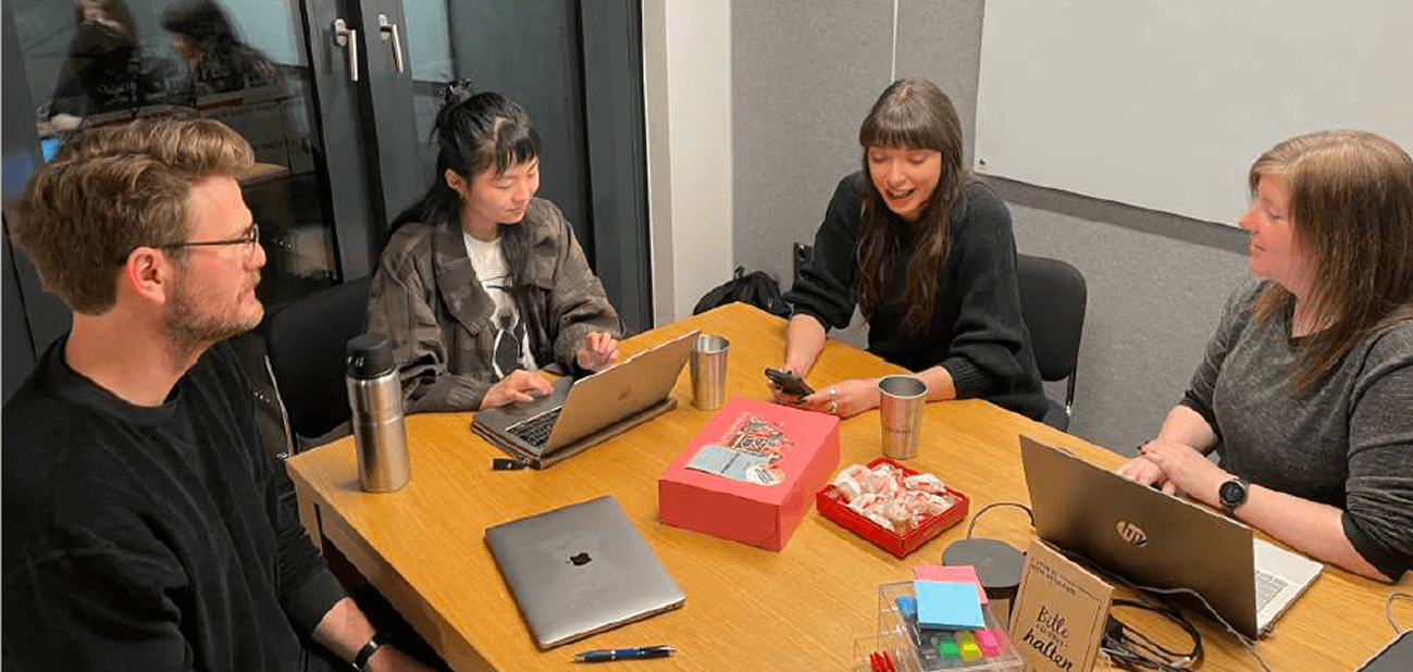
There’s no substitute for in-person testing. A good tester picks up on subtle expressions, body language and throwaway comments. They are ready to meander off-script to explore the hint of something more.
Everyone has a unique perspective. At the same time, it's interesting to see which things, positive and negative, are universally received. Because qualitative research goes so deep, surprisingly few sessions are required to see repeating patterns and get meaningful results. We ran 5 tests, each about an hour in total. Exploring both the embedded and standalone versions, we carefully recorded our findings.
Extracting findings
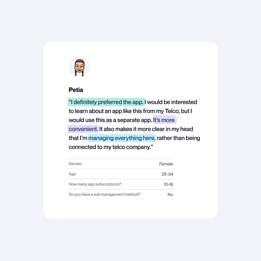
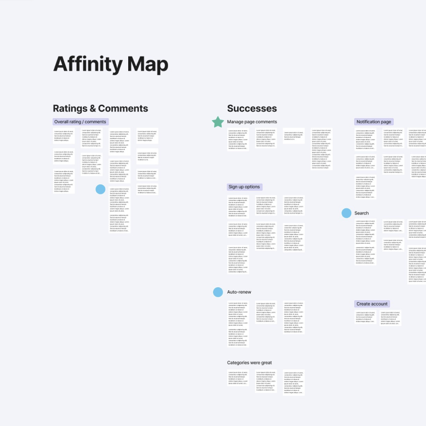
Making sense of all the information pulled from testing is an art in itself — here’s how we separated the wheat from the chaff. Detailed notes were taken for each session, and the important parts were highlighted and colour-coded to represent different themes. This way we extracted what was meaningful from each tester, but most importantly, we flagged common patterns across tests.
This rich data set was then transposed onto an affinity map and the insights were grouped into clusters and ranked for importance. Through this process, an enormously rich and complex data set was streamlined and summarised. The result of which was the user testing report.
Report
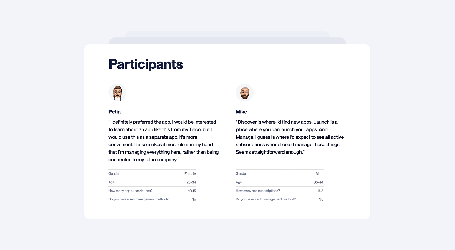
The report was a top-level summary of the testing methodology and key takeaways. It stated the objectives, summarised results, and suggested possible next steps, ranking items for both cost and ROI.
Branding
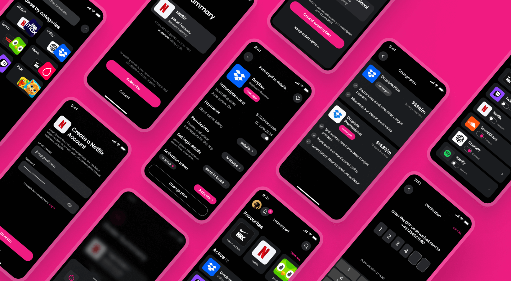
As this project was a new independent product within the Mondia family, a new visual identity was required. The aesthetic we created would be used to skin the mobile app, web portal, and ongoing promotional materials.
Brand book
In addition to the UI styling, we created a logo. This was summarised in the brand book.
Design sprint — 1.1
Following the testing report, the client decided that solutions to all medium and high ROI items should be explored in the next design sprint. This involved approximately a dozen items ranging in size and complexity. Here are two examples.
Hidden in plain sight
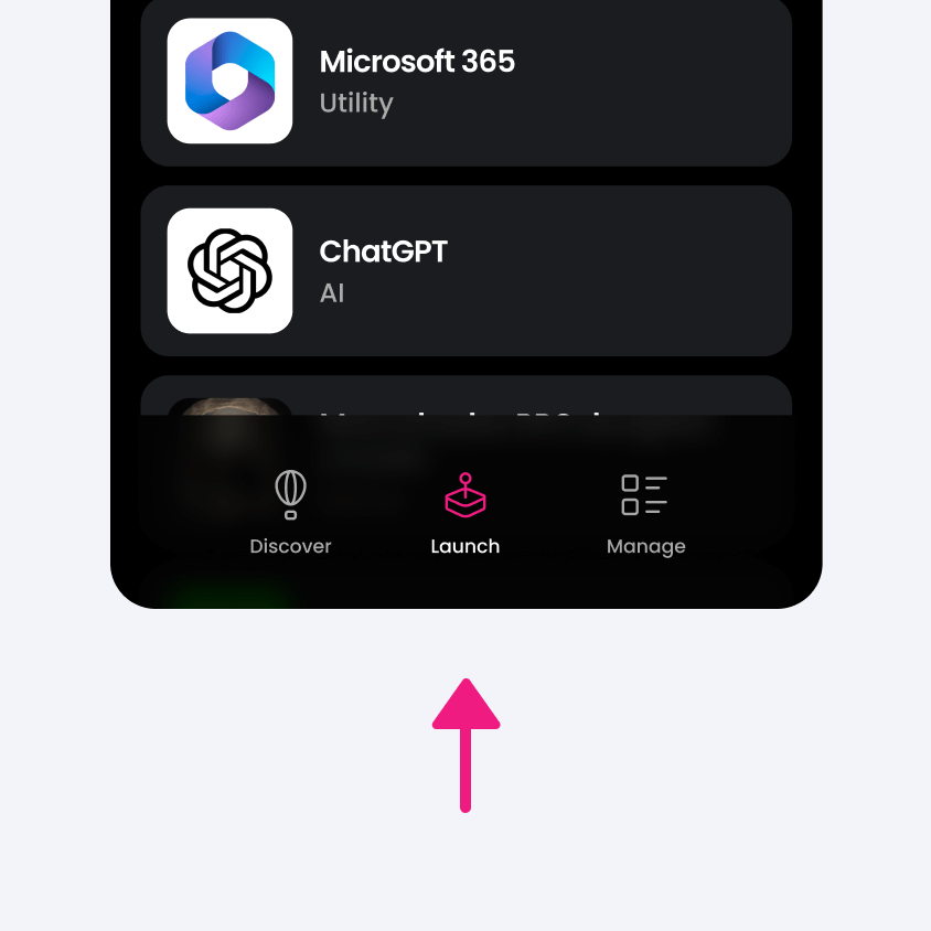
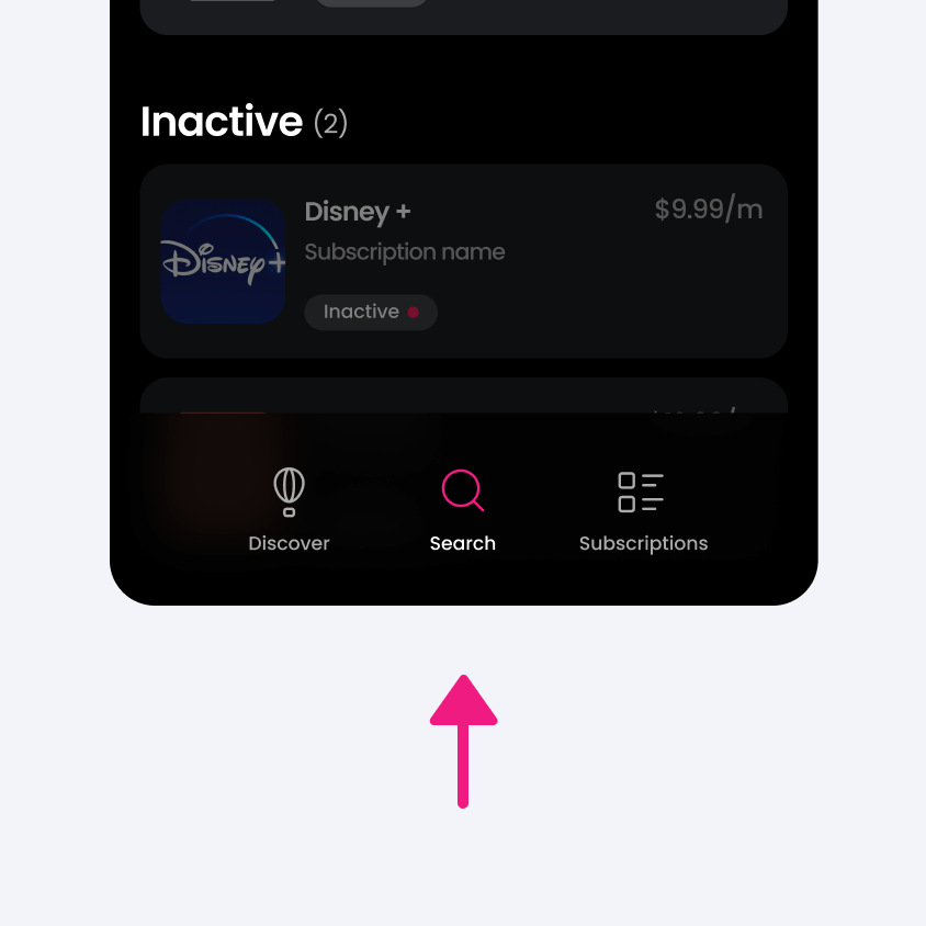
An especially controversial item was the placement of ‘launch’ on the primary navigation. This was driven by sales-focused stakeholders that struggled with a user-centric mindset. Testers hadn’t actually complained about it on their own, but when prompted (with open questions) they all independently confirmed the current solution was confusing and didn’t make sense.
Really bad issues are easy to identify, and therefore, often caught. It’s the subtle issues we need to look out for. These can seep in unnoticed, increase in number, and quietly erode a product's UX.
As designers, it’s our job not just to solve problems, but to present solutions that go beyond the imagination of users.
From fuzzy idea to feature
Sometimes, it’s what’s missing that matters. An exciting insight that emerged during testing was a request made by multiple testers independently. They wanted more transparency on the financial aspects of their subscriptions. The general desire was clear, however, exactly what the best solution for this might look like would require further exploration.
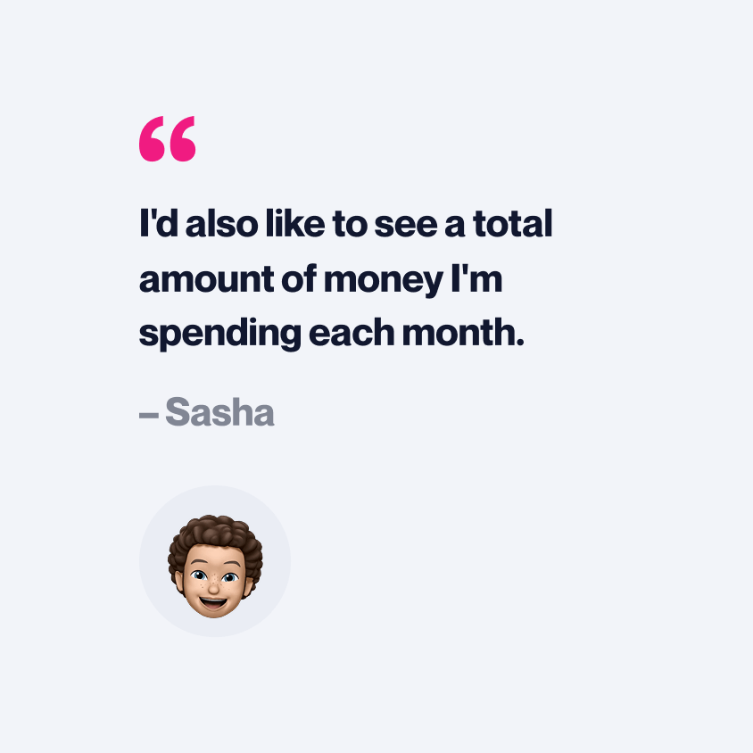
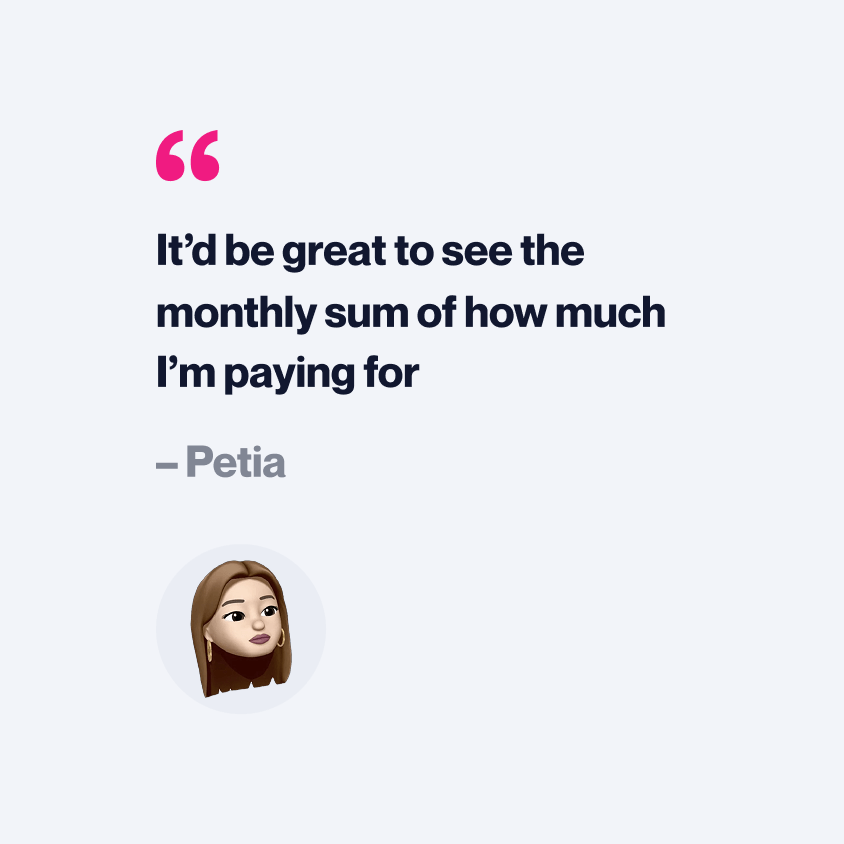
The finance feature went through typical iterative development. While simply hacking in the money value everywhere would have ‘solved’ the problem, we went to considerable effort to craft an especially elegant solution.
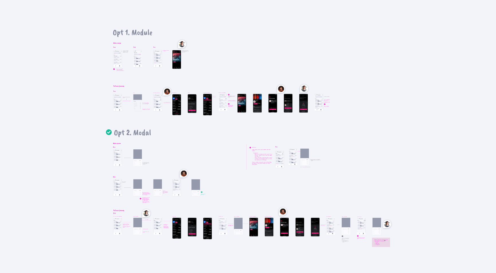
To maximise transparency on the challenge at hand, we created multiple scenarios and then ran competing concepts against each other. In this way we ‘stress tested’ what would perform best in all the required use cases. Finally we whittled back to two potential solutions.
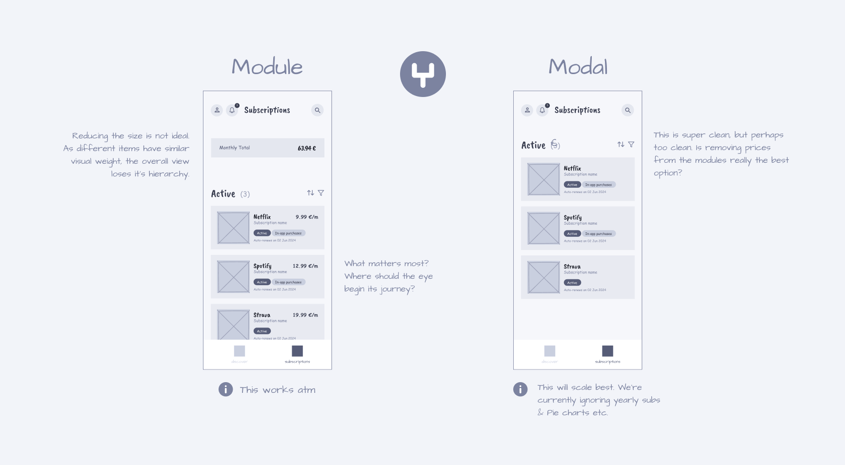
Even internally within our design team, there was still debate over which solution was superior. A great option for further testing.
User testing 1.1
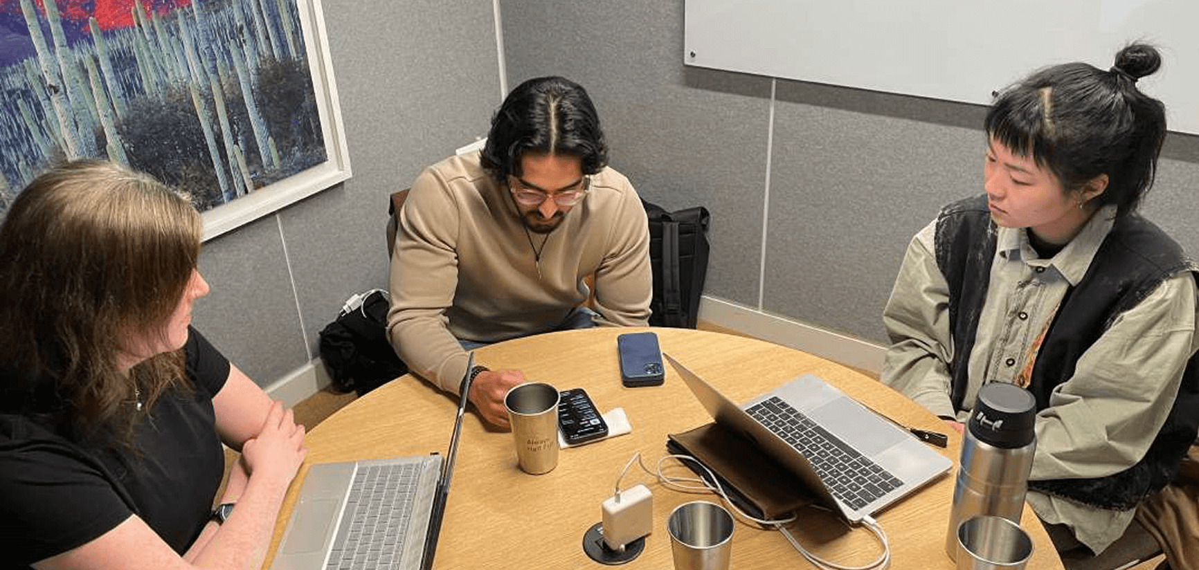
The second testing session had a different feel to it. We had already validated the general concept, now we were testing our adjustments. We ran five tests again. Three repeat testers, and two new.
Feedback immediately and organically focused on finer grain topics. This was a great sign. Rather than testers getting lost, or unable to complete an action, they commented on the wording of a button, or that something was slightly unexpected. They even started asking questions beyond the UI, like, would bundled purchases be possible in order to save money? The simulated product was becoming real.
Validation
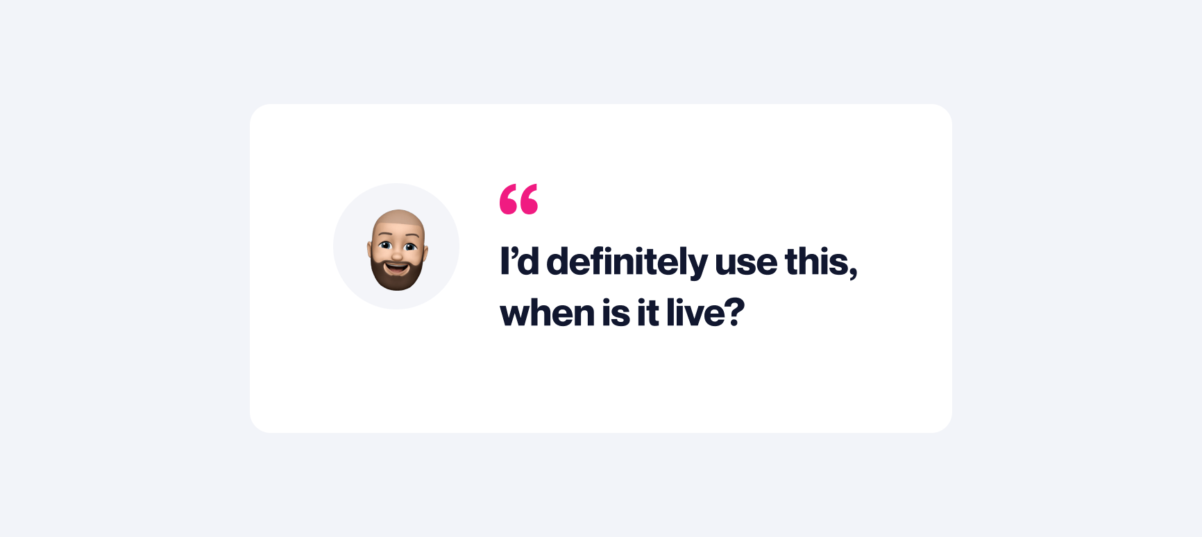
All the changes we made since the first test were positively received. The navigation and essential functionality were all smooth and intuitive. In addition to bringing the client’s concept to life, we made an exciting addition. The new finance feature was universally appreciated. What had begun as an insight from user testing, was ingested into our creative process and emerged as functionality that all testers appreciated. In fact, two testers said they saw it as core functionality. We even heard the magic words from one:
“I’d definitely use this, when is it live?”
How much is enough?
Of course, in addition to all the positivity, we still received constructive feedback. However, the significance of each item was dramatically reduced.
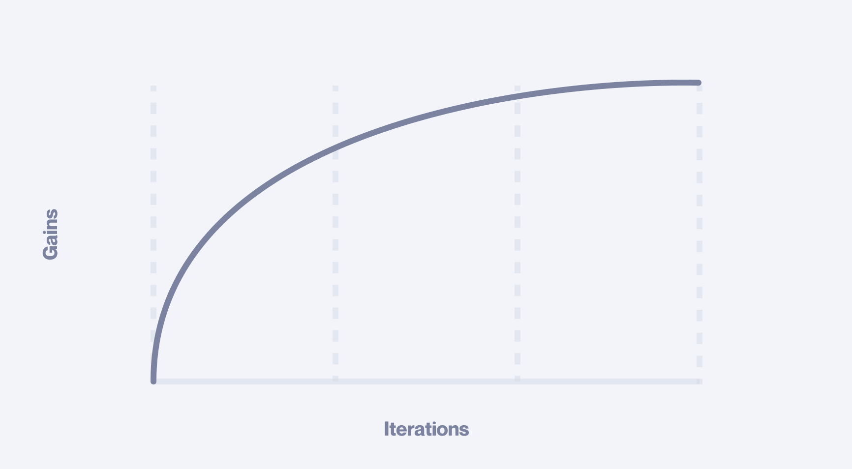
This is a common pattern when user testing is done right. Successive sequences return feedback on finer and finer details. This ‘zooming-in’ effect typically coincides with a reduction in strategic value. The first couple of sessions return significant results, and then gains quickly diminish.
Report
Again, we extracted and summarised all our findings in a neat report. Stakeholders reviewed and approved all the high-priority items, which were now comparatively small adjustments. The rest of the feedback was deemed too fine-grain or peripheral to be a blocker. The decision was made that we were ready to build. We made the final amendments resolving the high ROI details and prepared our design files for the engineers.
Final deliverables
The final deliverable consisted of 3 fundamentals. We produced a master document that mapped the entire product, a design system that gave engineers ready-to-use styles and components, and a brand book that defined how the new brand should be used.
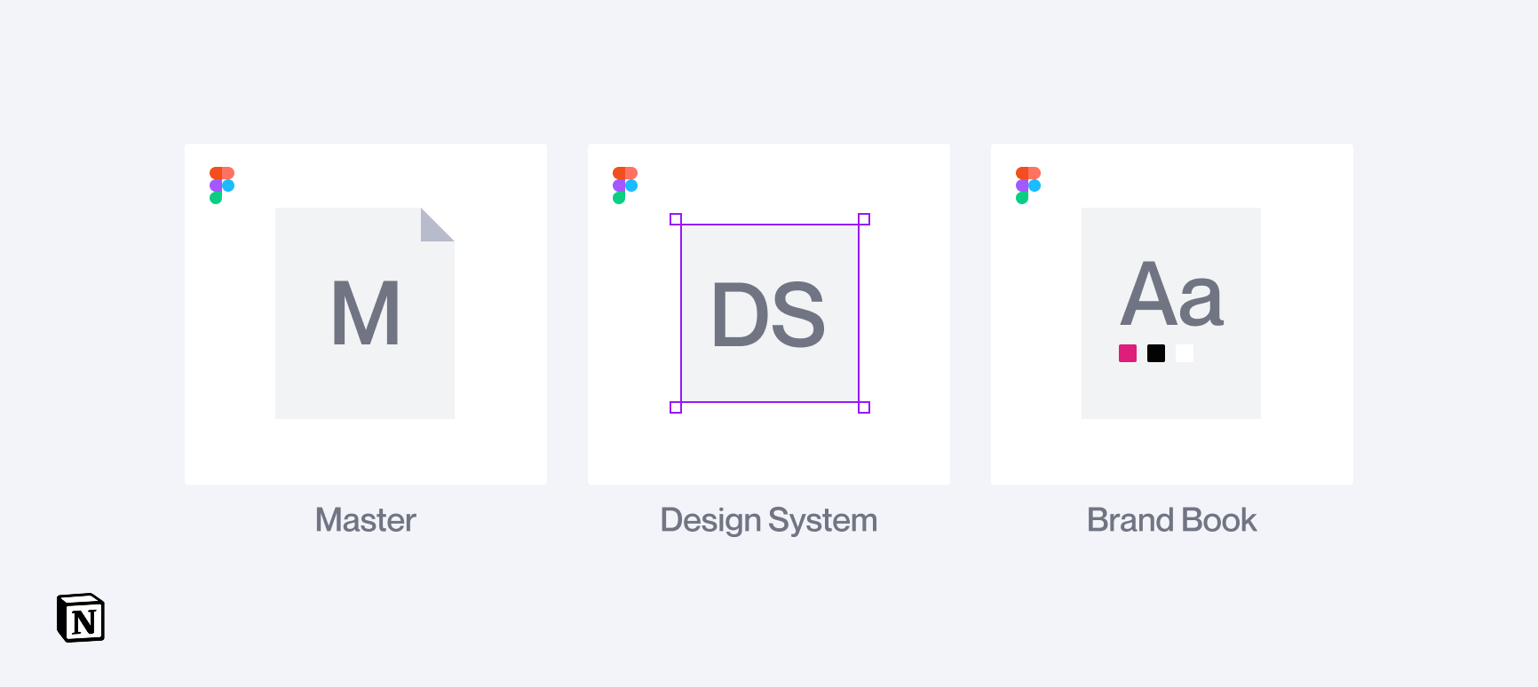
We wrapped everything into a single, well-structured Notion page, making the handoff seamless and giving the client an intuitive hub they could reference and use with ease.
Have a project in mind?
Share your idea with us!
