Beyond MVP to scale-ready product set for growth
Ruuky — Case Study
Summary
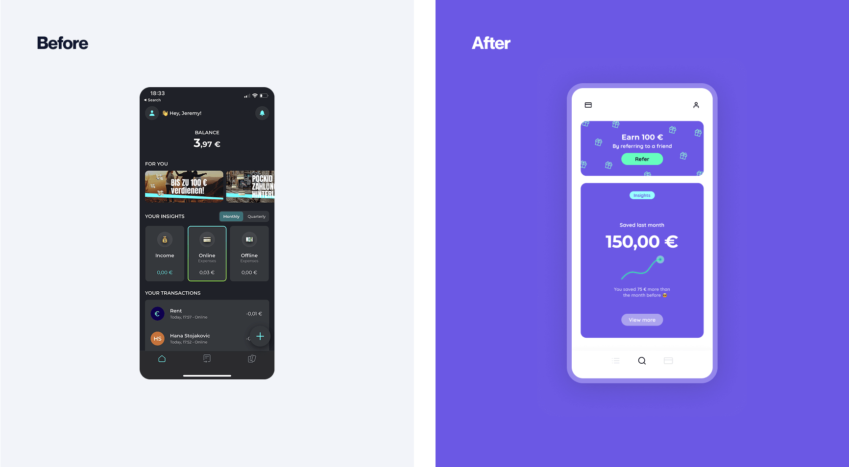
Ruuky is Germany’s first neobank designed specifically for Gen Z. The founders came to us with an MVP that had driven explosive growth and secured funding, but had reached its limits in every way. Ruuky’s potential was limited by clunky navigation, outdated architecture, and an unpolished MVP aesthetic.
To realise the team’s bold new vision and position the platform for scalable growth, we needed to start from the ground up. We delivered a complete redesign that revamped navigation, added key features, and implemented a stand-out new look that speaks directly to their Gen Z audience.
Project Spotlight
A complete product redesign that set the stage for growth
Transformation
Endless iteration leads to tangled UX. Over time, the small additions and patches start to overlap and the product loses its sense of cohesion. What was once healthy incremental improvement hits a ceiling. To progress beyond this point, a full break and reset is required. We call this phase of the process ‘transformation’. Here, we discard the bad, preserve the good, and add the new — setting the stage for future growth, and the next phase of iteration ahead.
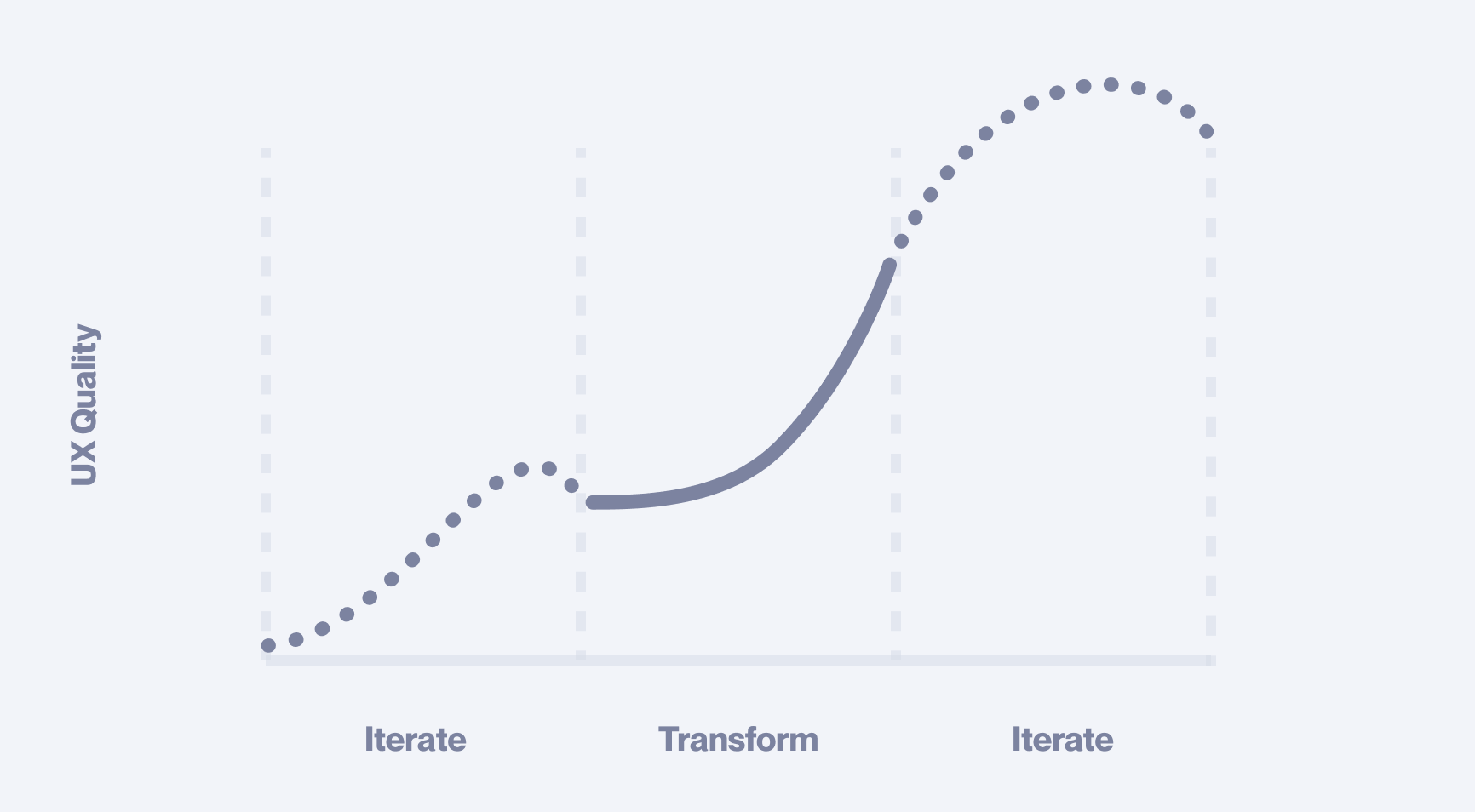
The best product design follows a continuous two-phase sequence
This is exactly what the Ruuky founders hired us to do. They had a deep understanding of their MVP challenges and a clear vision of what their future users required. They kicked us off with their product hypotheses, and together, we rigorously tested each assumption before setting out to bring the concept to life. The new redesign would build on previous successes and insights. However, conceptually, we were starting from a clean slate.
Strong foundations
App architecture is the underlying structure of a digital product. It might seem counterintuitive, but an elegant final result actually begins with deep foundations. Everything is downstream from that.
Deep foundations refers not to the backend or the code base, but instead a deep understanding of the hearts and minds of our users.
To ensure this user-centric focus, we used the “Jobs to Be Done” (JTBD) framework, which helped us isolate features based on real user needs.
By visualising the relationship between each JTBD and its associated feature, we identified the optimal navigation setup. This, in turn, shaped the app architecture of the frontend of the product. Composing from the ‘inside out’ like this is a fundamental step in creating an ‘intuitive’ end result for our users.
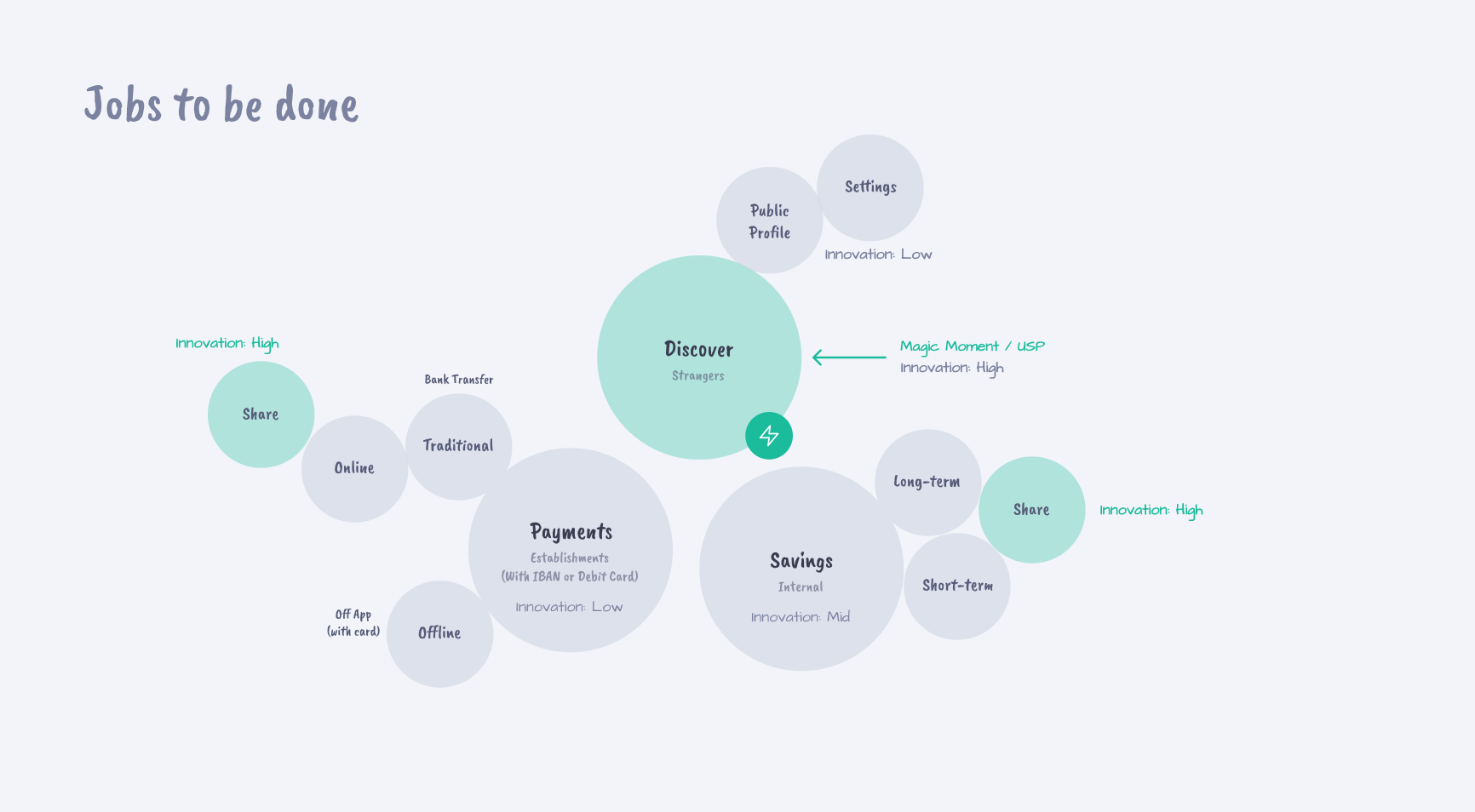
The above model visualises the radial symmetry of JTBD items and their child elements. This is the initial formation of both the navigation and central structure of the app. This then flows naturally into structuring the project itself.
Get your free UX Audit
We offer a limited number each month. See if you qualify!
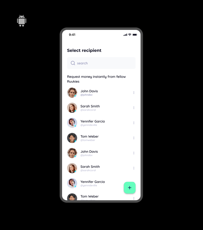
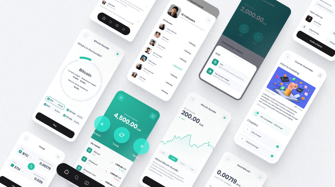
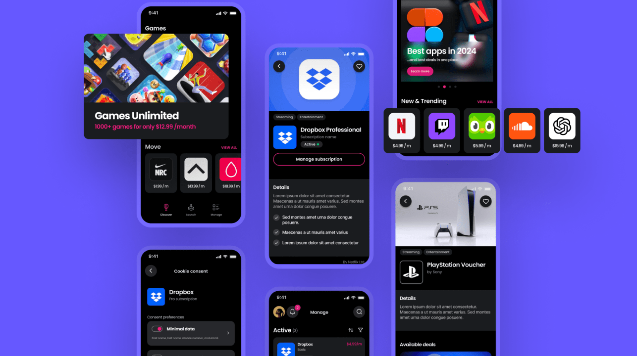
Growth by design
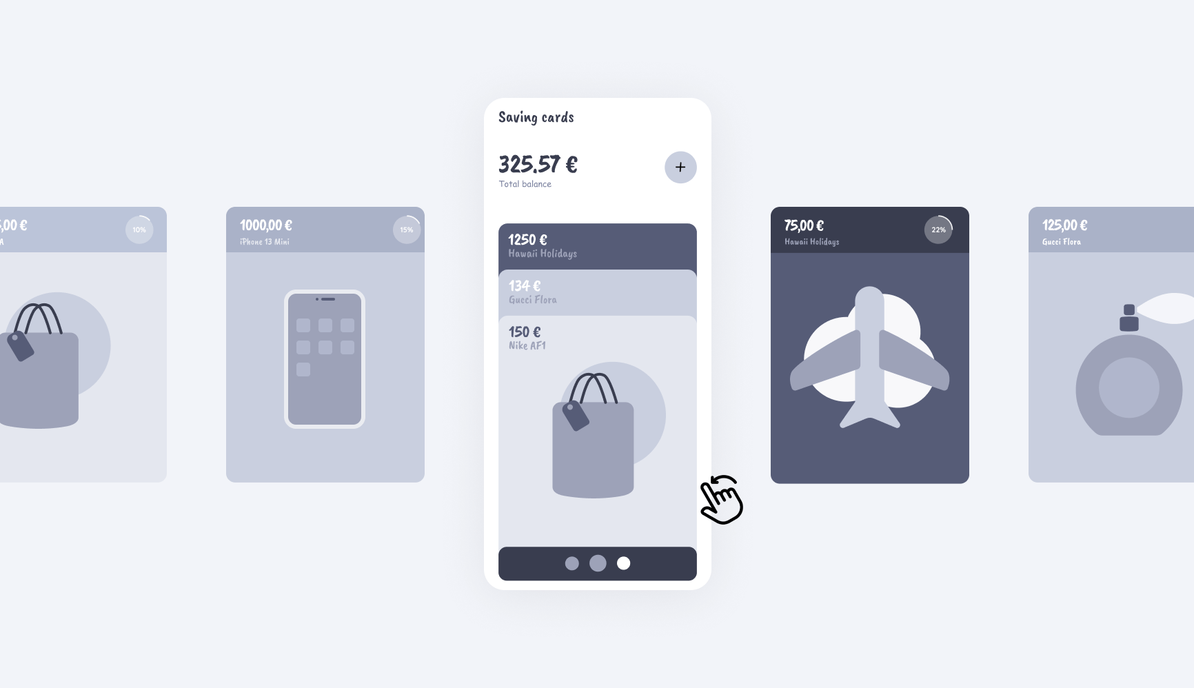
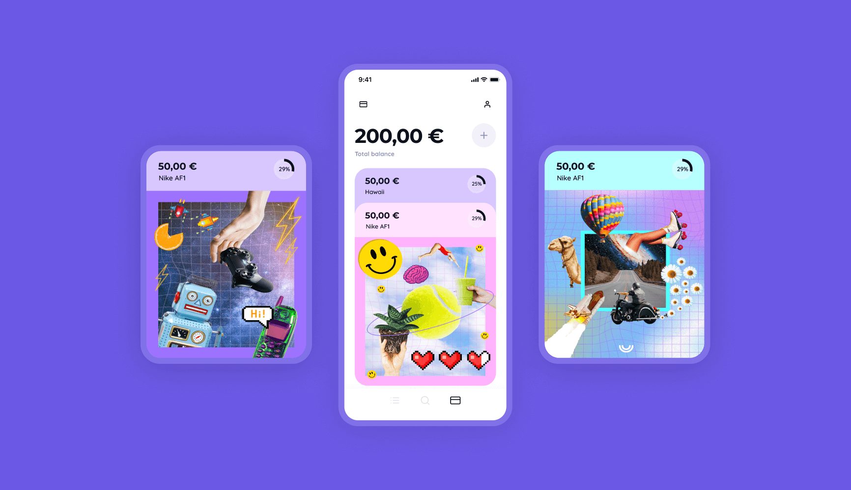
The savings card was the most innovative feature of the redesign, serving as the central element driving growth. It not only distinguished Ruuky from competitors but also boosted user engagement.
The best type of differentiation is not a fluffy marketing campaign. It’s placing the essence of what makes your offer special at the very centre of your product’s UX.
Marketing then magnifies that truth. With Ruuky, the savings cards would act as sub-accounts in which users organise their savings efforts. The bold Gen Z imagery of the cards could be customised and shared on their built-in social media feed.
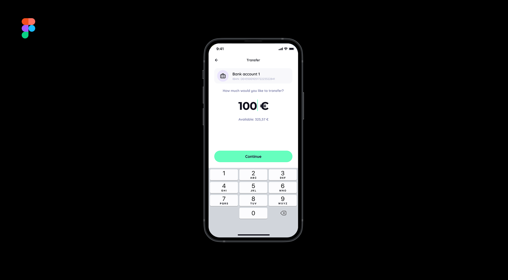
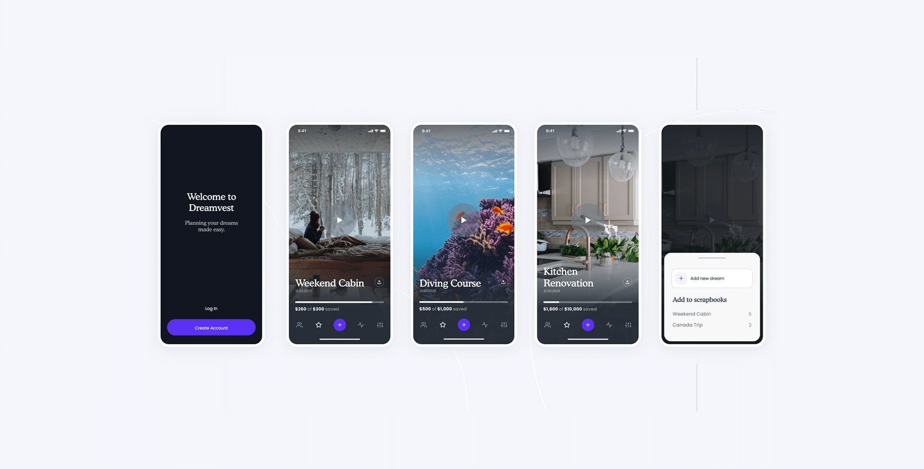
Early wireframe exploration
This product keystone would create the ‘magic moment’ for Ruuky’s users. i.e. The moment they experience something that resonates deeply with their wants and needs and is something they’ve not seen before. We emphasised this feature with thoughtful interactions and animations — subtle touches that make the experience feel special.
Not just another fintech
The Ruuky founders were clear from the start—they wanted the product to stand out, and be completely different from anything else in the market. This was true for both their core value proposition and their main feature, and should be emphasised with styling choices.
Bold branding was the finishing touch, injecting personality and energy without compromising usability. Collaborating with the in-house marketing team, we ensured brand consistency and a seamless user experience, using block colours to communicate the founders’ vision without overwhelming the user or inhibiting usability.
Internal alignment
We created a click dummy for internal stakeholders and investors. Although not used directly for external testing, this step was invaluable in identifying areas for refinement, aligning the team, and gathering feedback to ensure the design was fully optimised before being handed over to engineers.
iOS and Android native
The founders chose to create native iOS and Android apps. This choice ensured users would enjoy a more performant and nuanced experience.
To maintain velocity during design exploration, we initially created a generalised solution fit for both platforms. Afterwards, we collaborated closely with Ruuky’s specialist engineers for both iOS and Android, tailoring various interactions and patterns for each platform. This involved many subtle details throughout. Here are two examples:
Native typography
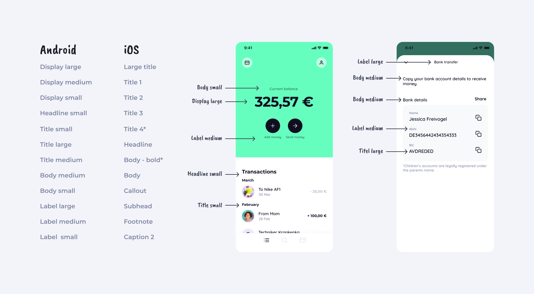
Both iOS and Android have their own type scales and naming conventions. As part of our handoff, we carefully mapped the elements from our general solution to their respective platform-specific domains and resolved any platform-specific issues in advance.
Native UI patterns
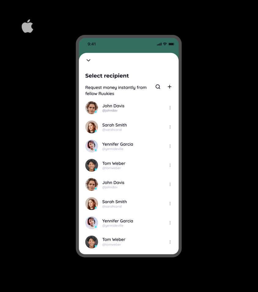
Above is an example of the types of nuanced tweaks that were scattered throughout the app. For the same view, Android featured a persistent search bar and floating action button, while iOS embraced a more minimalist approach with a hidden search bar and compact icons. These followed best practices for each respective platform.
All at once
To ensure the overall project continued at top speed, we implemented a staggered handoff of our design materials. This involved breaking the project into sections, preparing each one for engineering, handing it off, and continuing work on the remaining sections in parallel.
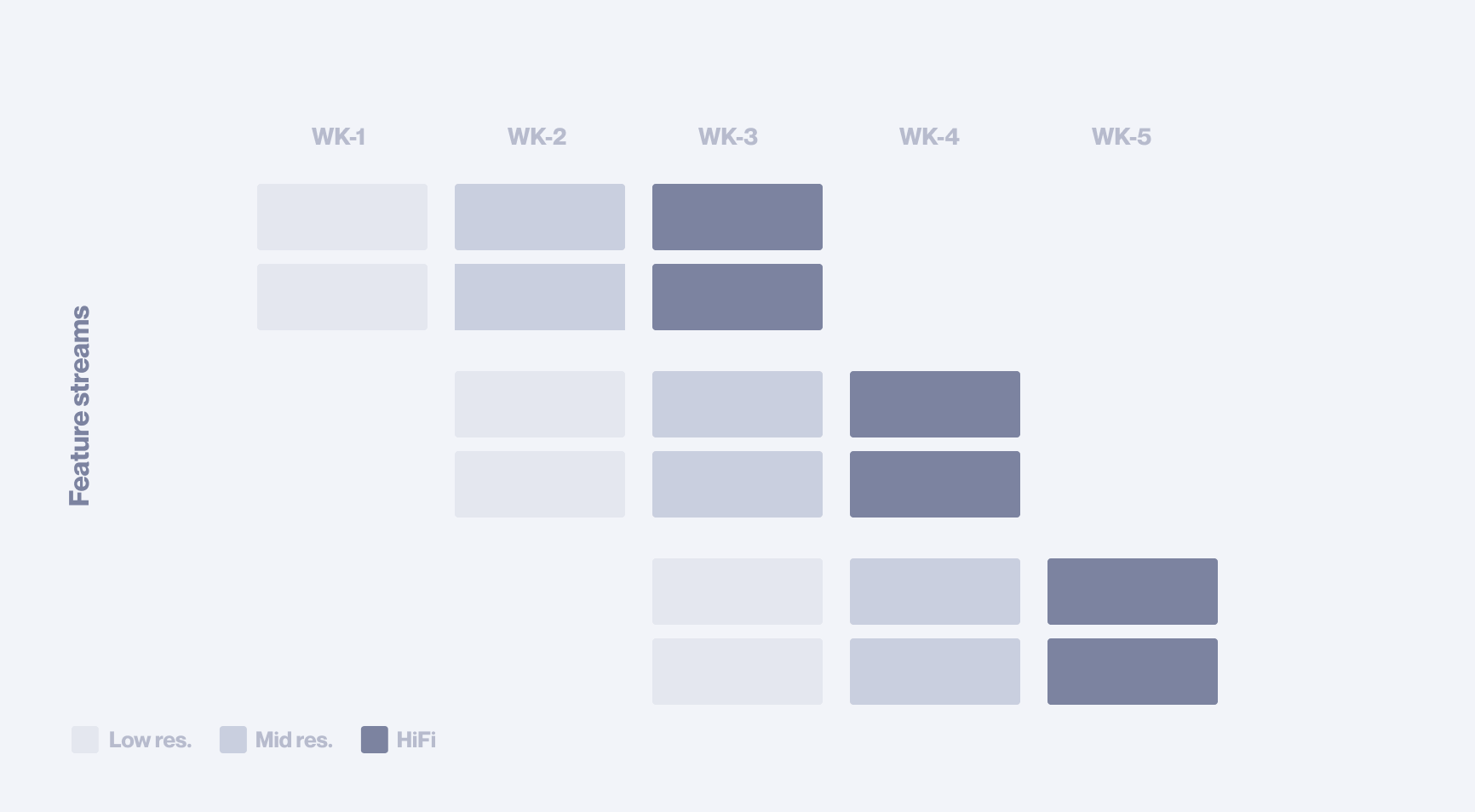
Our robust creative process supports this approach. The same solid structure that ensures a future-proof design also allows us to break the work into manageable segments without risking fragmentation.
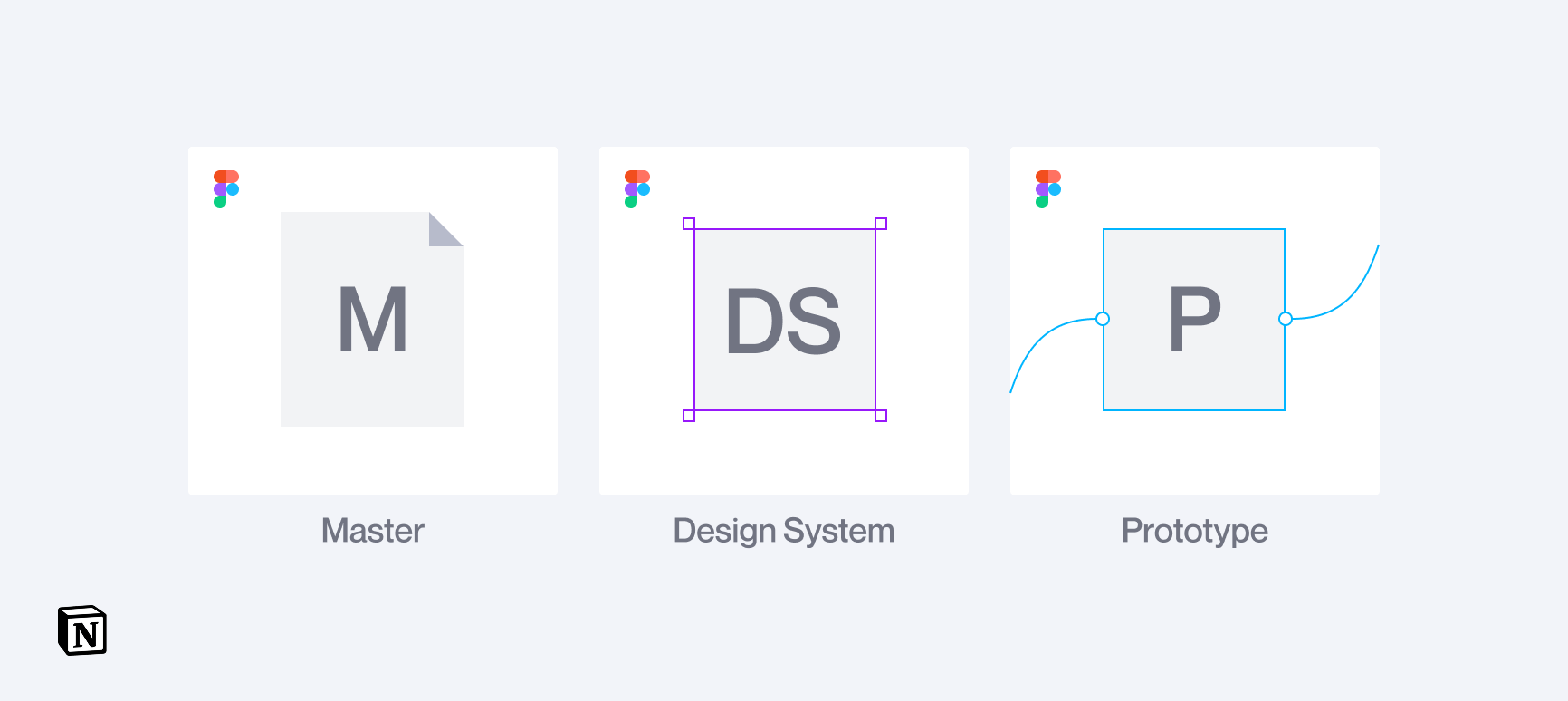
Delivery on all fronts
The final deliverables came together in three key pieces: a master document that captured the full vision of the product, a design system that equipped engineering with clear styles and components, and a high-fidelity prototype that transformed the concept into an interactive experience.
Ruuky wanted it all—huge scope, rapid execution, and a killer feature that would differentiate them in a crowded market—and they got exactly that
The new savings card feature gave Ruuky a distinct edge over competitors, giving its users a unique magic moment. Plus, Ruuky’s robust, future-proof architecture ensured that upcoming features could be added seamlessly, enabling the entire company to coordinate and scale smoothly into the future.
Have a project in mind?
Share your idea with us!