How to create the best UX with your digital product
June 5th, 2024
Crafting a delightful user experience for your product will increase both traction and retention, and reduce bounce rates and churn. Sounds great right, but how is it actually achieved? A common place to get stuck with early-stage products, is an MVP (or earlier) that feels like a bundle of separate features. It solves user problems, but combined, all together, it’s missing something. It’s missing that cohesive centre that pulls it all together. It’s missing that finger-snap moment where users fall in love…
The secret
Great UX isn’t something you stick on at the end. It can seem counterintuitive. But the way to create a beautifully refined product starts long before the finishing touches are applied.
A delicious cake is not just about the icing.
It starts with the recipe itself. The ingredients. The process. All of it. The icing and the cherry on top enhance the essence of the fundamental flavours. They provide a sumptuous focal point for the overall experience.
This is the secret to great UX. Not in isolation, but together. Not a series of independent pieces, but a unified whole with a carefully crafted focal point. This is how we create an experience that exceeds the sum of its parts. By considering all the factors right from the very beginning.
Creating digital products
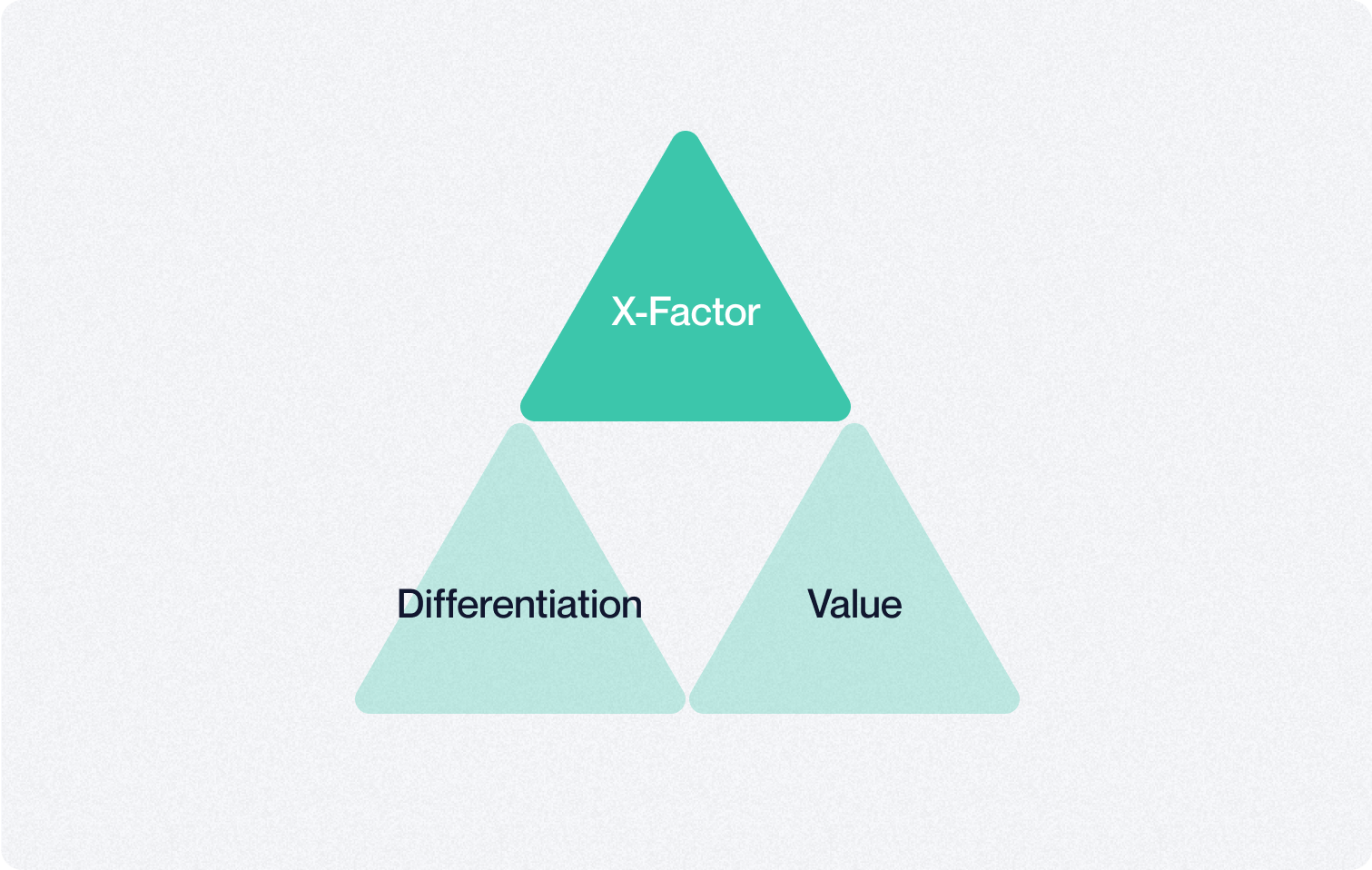
Just as the quality of ingredients will dictate the final flavours of the cake. So the foundations of our product will dictate the potential quality of the end user experience. Three essential elements matter most.
Value: A clear and robust value proposition is essential.
Without this, you will be tempted to rely on flashy gimmicks. These are never satisfying.
Differentiation: Something about your offer must be fundamentally (and functionally) unique. Without this, you’ll rely on false and phoney narratives to try to distinguish yourself.
X-Factor: By combining your core value with what makes you unique, we craft your x-factor. This is your cherry on top.

Bringing it all together
Your designer can then present your x-factor to your users (via your interface) in the most direct and engaging way possible. In this sense, design does not create — it transfers. Our goal is to transfer value to our users in the purest way possible.
If your UX is currently underwhelming (assuming your product creates real value by solving a problem users want and need) there is likely too much noise and distortion in the transfer of value from product to user. These are the two most common culprits:
- Too much clutter: You have a bunch of average features distracting and diluting the stuff that actually makes your offer great.
- No hierarchy: You have a tray of cherries, but no dessert. The user doesn’t know where to start or what matters most.
The fundamental principles for great UX are alignment and hierarchy. A killer feature, presented loud and clear to the user. A set of supporting features, that do not compete but complement the primary function.
With a strong hierarchy, we create the illusion of simplicity. The user experiences maximum value, in its purest form. And when they need to dig a little deeper, the supporting features are only ever one click away.
If you’re aiming to create an outstanding user experience, and want to learn more about value creation, differentiation, and crafting your x-factor, check out our eBook on product foundations.

Jeremy Lefèbre
Founder
SlowLettuce | Copyright 2026


